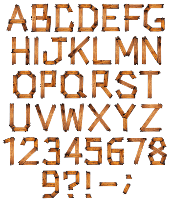
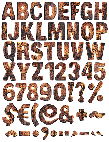
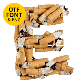
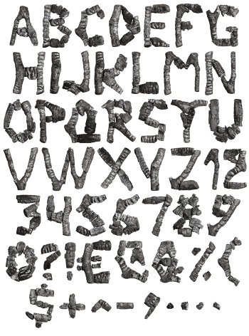
Struck, burnt and laid back down as letters. Matches Font assembles every glyph from spent matchsticks, black crusted heads at one end and pale scorched wood at the other. The straight sticks force clean segmented letterforms with no curves anywhere. It suits thriller covers, festival posters and safety campaigns, and it types from a plain OTF with transparent PNG letters alongside.
Matches Font Builds Letters From Spent Sticks
Strike the whole box, then arrange what is left. Each glyph in the Matches Font uses real matchsticks laid end to end, so the strokes stay stick-straight. Because a match is a fixed length, the letterforms break into clean segments rather than curves. Diagonals lean at whatever angle a stick allows, while an A becomes two sticks and a crossbar. The burnt heads land wherever a stroke ends, which reads as deliberate punctuation. Of course no two sticks burn the same, and that keeps the set from looking mechanical.
Charred Heads and Pale Raw Wood
Colour splits the alphabet in two. The heads sit almost black, crusted and swollen where the flame finally died. Below them, though, the wood stays pale cream, with a scorched gradient between. Since every stick burned differently, some letters carry more char than others. Meanwhile the grain shows clearly on the raw ends. Shadows fall soft and short, so the sticks look like they rest on a surface rather than float.