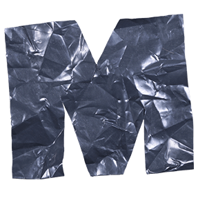
Carrier bags, scrunched and twisted into letterforms. Green, yellow, blue, red and clear polythene bunch together inside each glyph, so the creases run in every direction at once. Light passes through the thin patches and stops at the folded ones. It is cheerful and slightly guilty at the same time, which is exactly the point.
Bags, Not a Bag Texture
These letters come from actual carrier bags, so handles and seams turn up mid-stroke. Green dominates most glyphs, while white, yellow, red and blue push through the folds. Nobody ironed anything flat first, because the crumple is the whole appeal. Sharp creases catch light along the ridges, then soften into shadow in the hollows. The Color Plastic Bags Font keeps the thin, slightly greasy sheen that polythene always has.
Cheap Material, Careful Build
Bunched plastic could easily lose the letterform, so every Color Plastic Bags Font glyph keeps some discipline in the twist. Stems stay straight, though, even where the bag bulges outward. Counters hold their shape too, since a blocked bowl kills legibility instantly. Colour placement changes letter by letter, therefore the alphabet never falls into a pattern. Translucent patches also let the background glow through in places. Above all it still reads as type, not as rubbish.