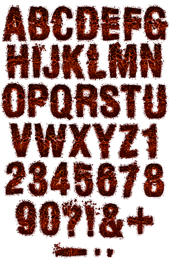
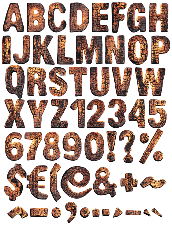
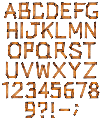
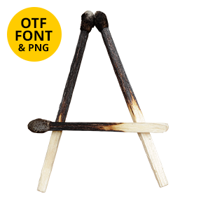
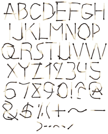
Somebody raked out a dead fire and stacked the biggest lumps into letters. Each stroke is a run of charred chunks, butted end to end with the joins left open. A silvery ash bloom sits over the black, and the broken ends catch the light. Rock covers, industrial branding and winter packaging all suit it.
Built From What the Fire Left Behind
Nobody carved these letters, of course. Someone raked out a dead fire, then stacked the biggest pieces until they looked like an alphabet. So every stroke is a run of charred chunks, butted end to end with the joins left open. Because the pieces never match, the outline stays lumpy and the baseline wanders. Besides, the numerals were built the same way, piece by piece. In short, the whole thing reads assembled rather than drawn.
Silver Ash Over Black, Chunk by Chunk
Burnt timber does not stay black for long, naturally. A grey bloom settles across it, and that bloom is what you notice first. Deep cracks run across each piece instead of along it, so the strokes look segmented. In addition, the broken ends catch the most light. Because the ash is pale, the letters lift straight off a dark ground. The Coal Font likewise keeps figures and punctuation under the same dust.