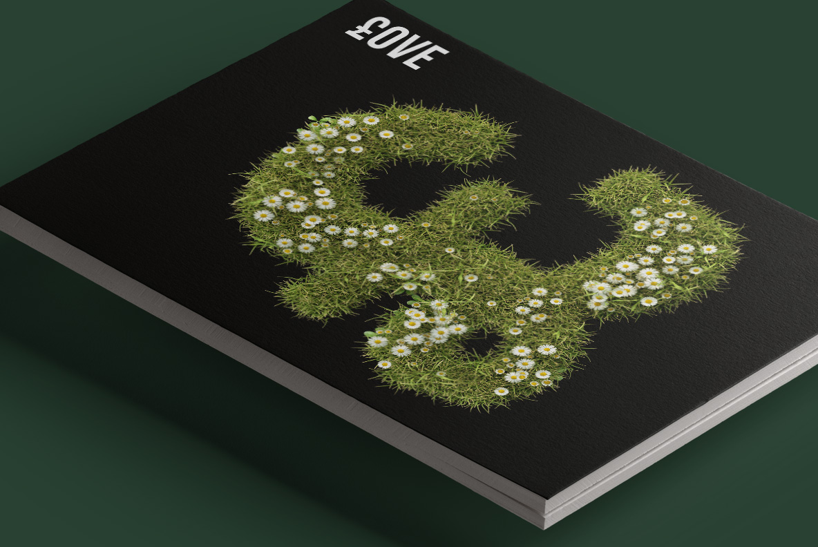
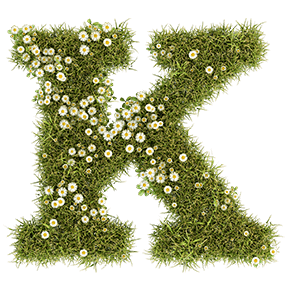
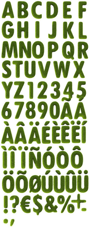
Unmown meadow grass with small white daisies pushing through it, cut into a heavy slab serif. The Daisy Font keeps thick stems and flat feet under all that greenery, so words stay solid while the blades break the outline. Every letter carries its own scatter of flowers, and repeated characters never look copied.
A Lawn That Grew Into Letters
Take a patch of unmown lawn, let the daisies come through, then cut letters out of it. Thousands of narrow blades point in every direction, so the outline stays fuzzy and alive. Besides, small white flowers with yellow centres scatter across each glyph, heavier in some spots than others. Because no two letters carry the same flowers, repeated characters never look copied. Deep olive sits underneath, while the tips go bright where the sun catches them.
Slab Serif Under All That Green
Look past the greenery and a proper slab serif is holding everything up. Thick stems, flat bracketed feet and generous counters therefore keep every word solid. That structure matters, since a soft texture usually dissolves at small sizes. Here the blades break the edge, yet the skeleton underneath still reads. Figures, currency signs and punctuation likewise grow in exactly the same way. Meanwhile the flowers never wander far enough to blur the shape, so the word holds its colour on the page.