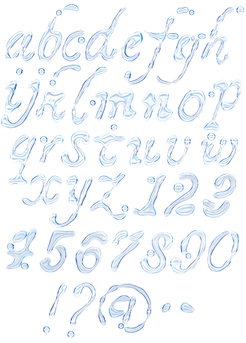
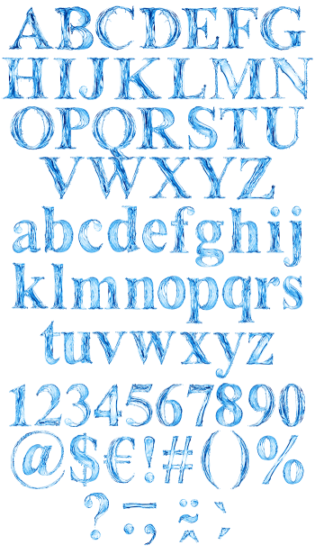
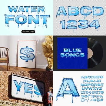
Clear water dragged across the page with a loaded brush, streaking along every stroke and thinning to spray at the ends. The Dripline Font leans forward with a real hand-lettered rhythm, and the pale blue stays translucent enough to pick up whatever sits behind it. Figures, currency signs and punctuation share the same wet finish.
Water Painted Straight Onto the Page
Naturally, each stroke looks like clear water pulled across paper with a loaded brush. Streaks run the length of every letter, bubbles catch in the thicker parts, and the tail ends thin out into spray. Light passes right through, so whatever sits behind the type tints it. The blue stays pale and cool too, while swimming-pool brightness never appears. Because nothing is opaque, overlapping letters darken where they cross. Above all, the marks read as painted rather than poured.
A Leaning Hand With Real Flow
Underneath, of course, the handwriting tilts forward at a steady angle. Strokes swell through the middle and taper at the ends, exactly the way a brush unloads. Capitals sit a little off the baseline too, which keeps a line lively instead of mechanical. Since the rhythm stays irregular, long words look hand-lettered rather than typed. Meanwhile the slant keeps whole sentences moving. Figures, currency signs and punctuation likewise carry the same wet finish.