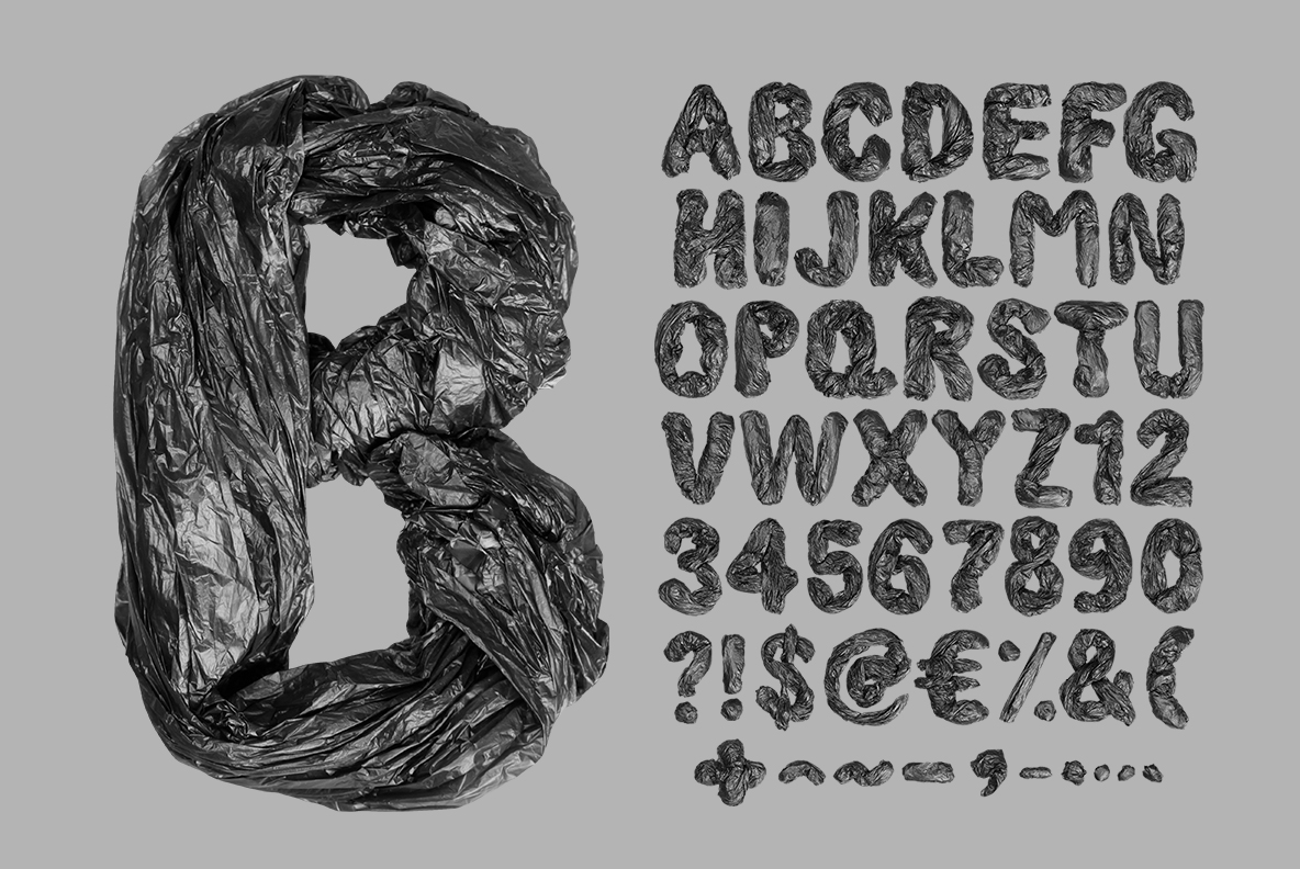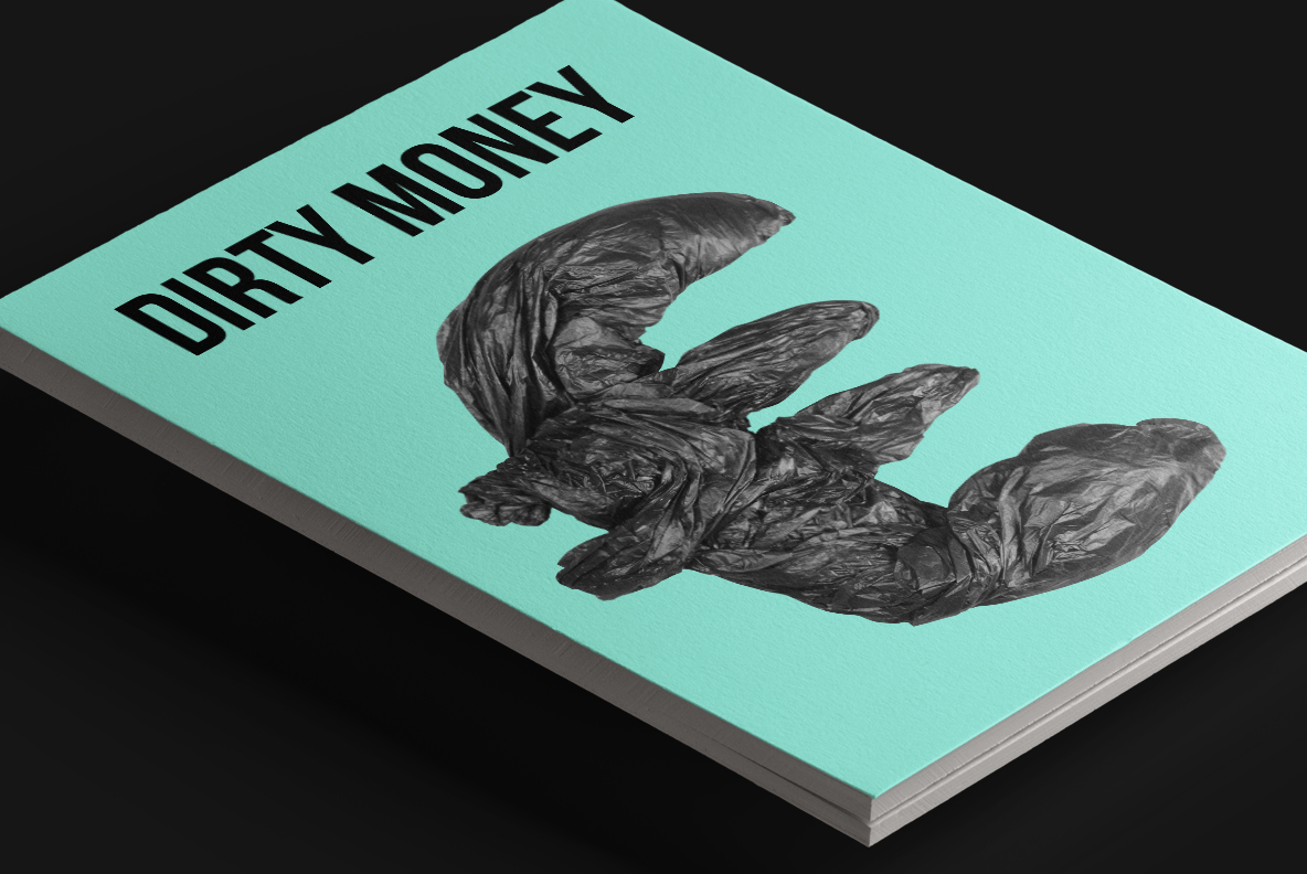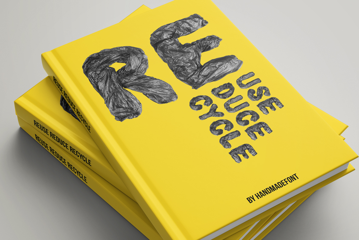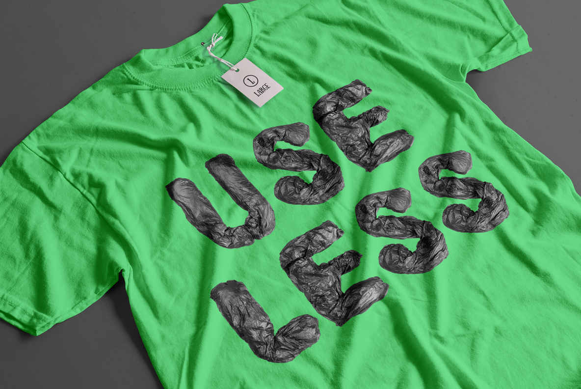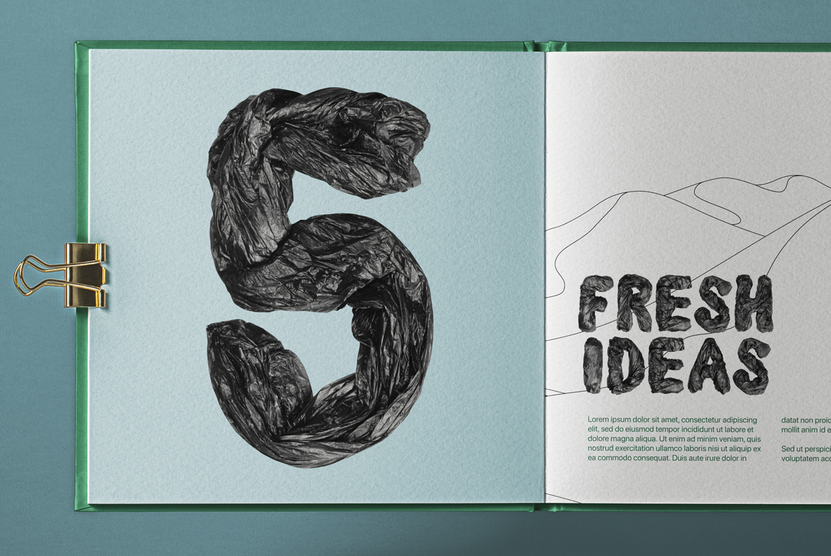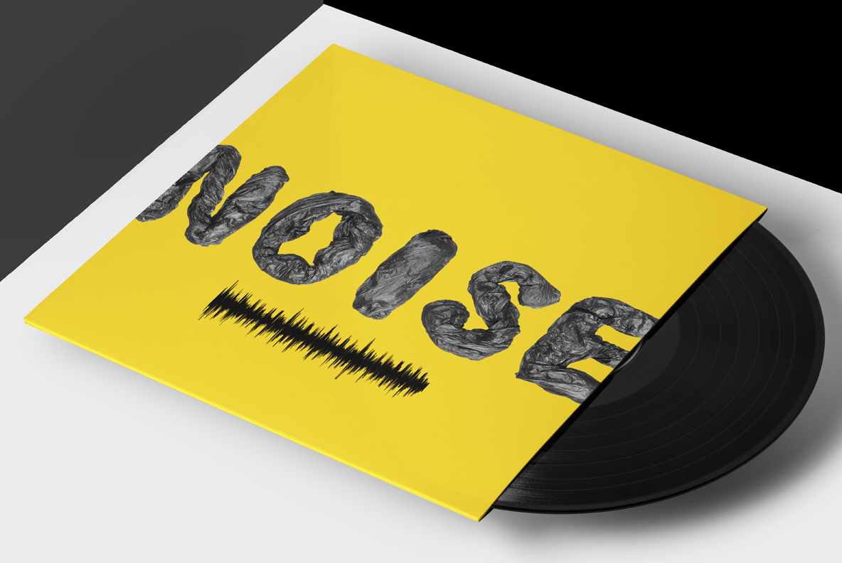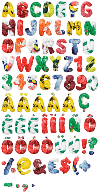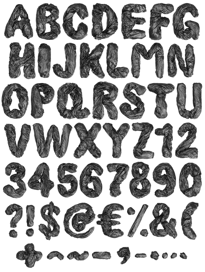

Black bin liners, emptied and screwed up until they hold a letter. There is nothing inside to keep them out, so the plastic collapses into a mess of fine creases. Hard highlights skid along the folds while the flat parts stay dull. Edges tear rather than cut. It is grubby, loud and completely on purpose.
An Empty Bag, Screwed Up
Empty bin liners, screwed up and pushed into shape. Nothing inside holds these letters out, so the plastic collapses into dense little wrinkles everywhere. Highlights skid along the sharp folds, while the flat patches stay almost matte. Edges finish ragged rather than cut, because a bag tears where it wants to. The Garbage Pack Font reads as black, though a grey sheen keeps it off pure black. Every glyph looks handled, obviously.
Crushed but Still Bold
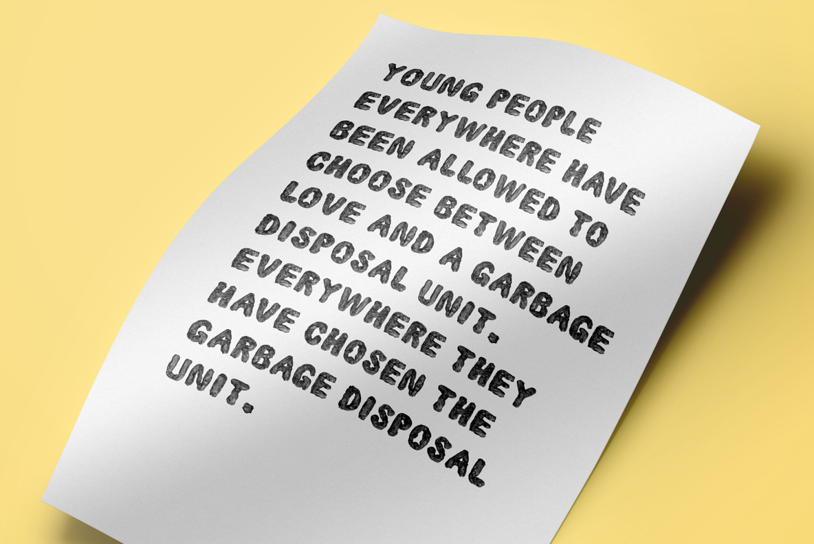
Crumpled plastic could easily lose a letterform, so the Garbage Pack Font sits on a heavy, wide skeleton underneath. Stems keep their width where the folds bunch up. Counters stay open, since a closed bowl would read as a black lump. The wrinkle scale changes from letter to letter, therefore nothing repeats visibly. Contrast runs fierce, of course: hard white highlights against near-black plastic.