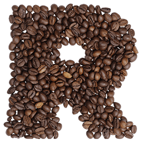
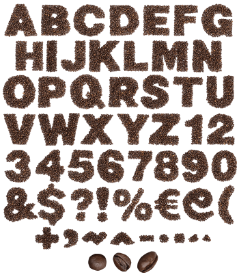
Coffee Beans Font packs whole roasted beans into heavy sans capitals, one dense layer deep. The roast is dark and oily, so highlights sit hard on every bean and the split down the middle catches the light. Beans stick out past the edges here and there, which keeps the outline honest rather than cut.
A Heavy Sans, Filled to the Edge
Start with a thick, ordinary sans and fill it with beans. That is the whole idea behind the Coffee Beans Font, and it works because the shapes stay simple. Strokes run wide enough to hold four or five beans across, so nothing gets lost in the middle. Meanwhile the counters stay open, and words read cleanly even at smaller sizes. Naturally the beans still do the talking.
Dark Roast, Not Medium
Colour matters more here than you would expect. These beans are roasted almost black, and oil on the surface catches a hard highlight along every curve. The split down the centre shows on nearly all of them, which is the detail that sells a close-up. Nothing looks dusty either, since the sheen stays wet. Because the beans sit in one layer rather than a heap, the letters keep a firm edge.