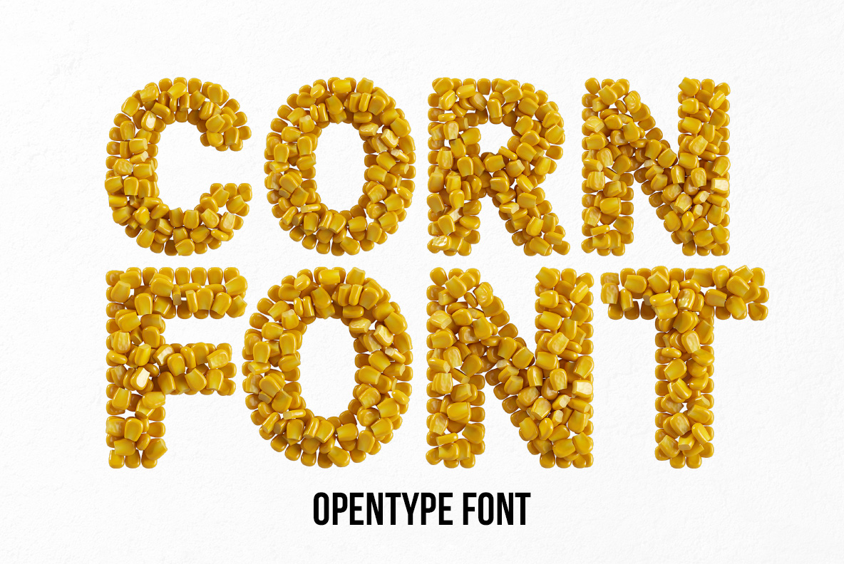
Corn Conserve Font. Sweetcorn Kernel Letters

49.00$ 19.60$

Sweetcorn straight from the tin, glossy and butter-yellow, heaped several kernels deep until each letter swells out of shape. A bold rounded sans holds underneath, so words stay readable through all that produce. Strays roll off the baseline for good measure. Made for canned-goods labels, farmers markets, taco menus, barbecue flyers and cheerful childrens covers.

Read more about licensing

Buy more, pay less — 5 fonts −30%, 10 fonts −50%

Straight From the Tin

Kernels this shiny have, in fact, been sitting in brine. Each one also looks plump, deep butter-yellow and wet, with a hard little highlight riding the top. Besides, they pile several deep, so the outline of a letter swells and dips instead of running straight. A few strays even tumble off the baseline, which is exactly what happens when you tip a tin out. Naturally the light bounces around between them. Nothing about it looks dry, after all.

How the Corn Conserve Font Holds Together

A bold rounded sans hides under all that produce, though. Because the skeleton stays simple, the Corn Conserve Font still reads at a glance, even though the surface is chaos. Kernels also bunch tighter on the joints and looser at the ends, so strokes look poured rather than arranged. Yellow meanwhile stays warm throughout and never turns acid. Above all, the shadows between kernels give each letter real depth. Even the numerals keep their heap, of course.

Animated preview cycling through kernel-packed characters of the Corn Conserve Font

Labels, Farm Shops and Summer Menus

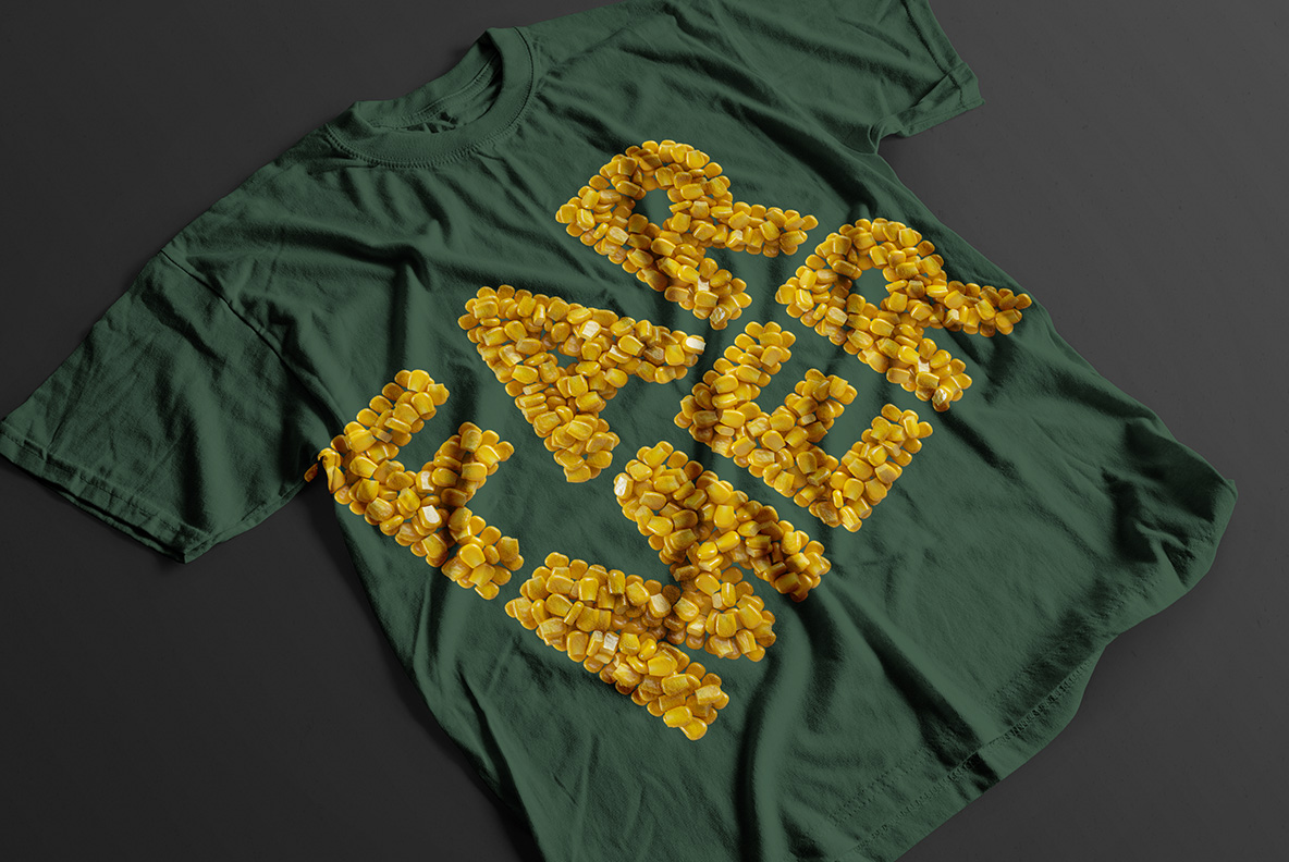
Tinned-goods labels want exactly this, naturally. Farmers markets, taco joints, barbecue flyers and cereal packaging also reach for the same cheerful yellow. Childrens titles take it well too, since nothing about it is sharp. Our mockups then run it across a cookbook cover, a magazine spread, a dark green tee and a pair of paper carriers. Besides those, a close-up shows just how glossy each kernel sits. Summer festival print suits it as well, because the colour already reads as sunshine.

Corn Conserve Font, Ready to Type

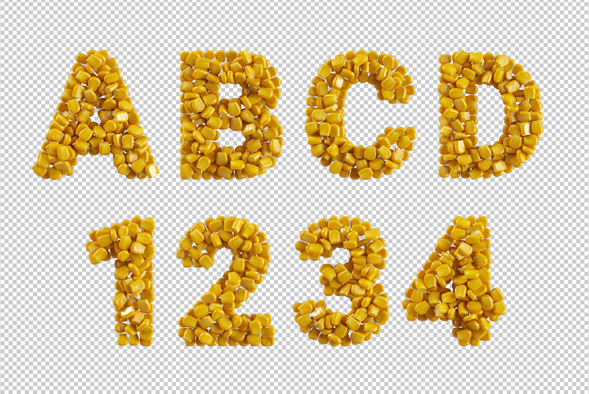
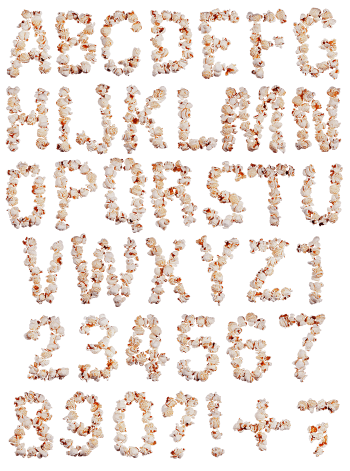
Installation is ordinary, since it is an OTF and you type words instead of placing letters. In addition, high-resolution PNGs of every character come along, each on a transparent background. Dried kernels, rather than tinned ones, fill our older Corn Font. Both therefore work together when a label needs a before and after. Meanwhile the Food Fonts collection keeps the rest of the larder.

White poster spelling a two-word title in the Corn Conserve Font above an OpenType caption
Large letter N of the Corn Conserve Font beside the full sweetcorn character set
Blue cookbook cover with a corn title set in the Corn Conserve Font
Close-up of the glossy yellow kernels that build every letter of the Corn Conserve Font
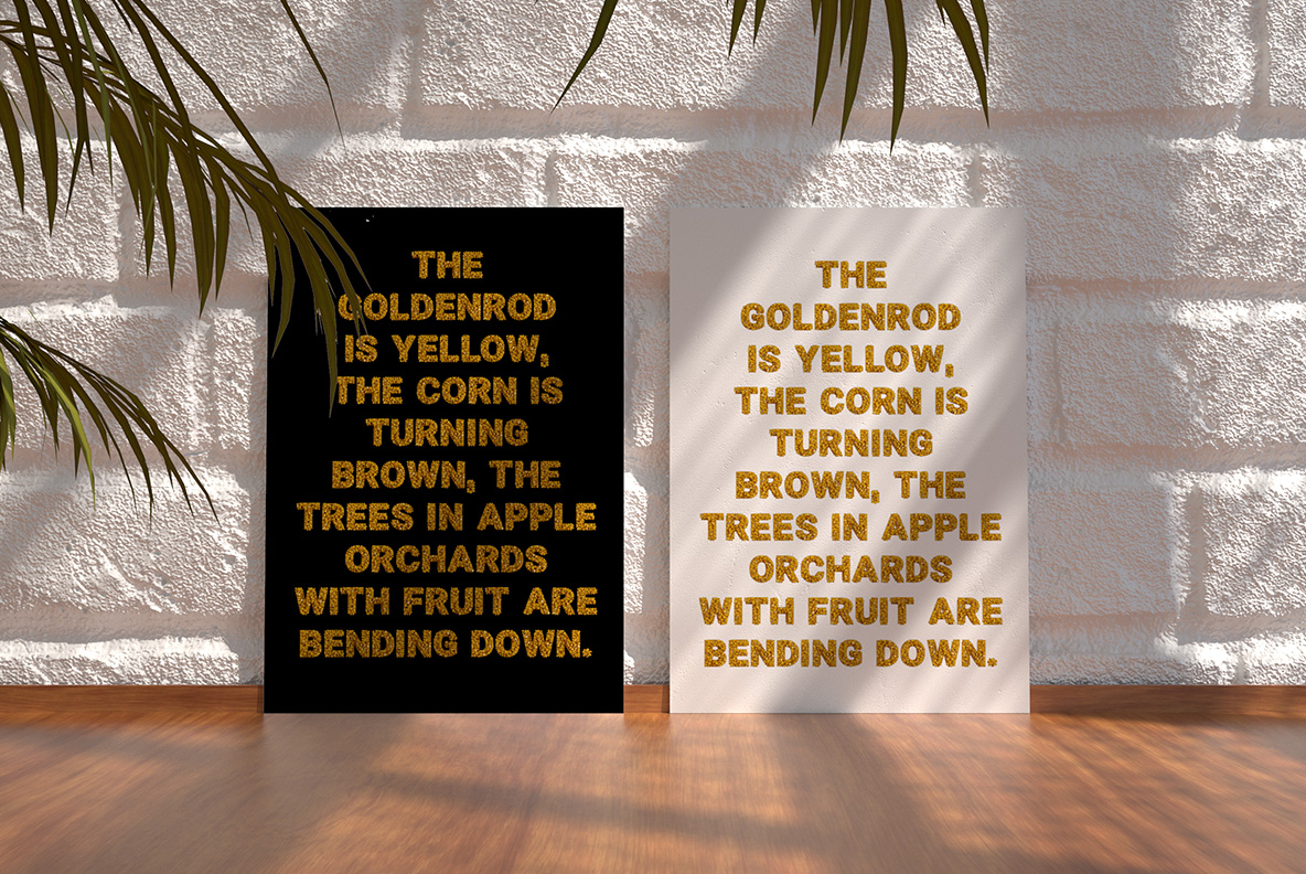
Two framed posters with a short paragraph set in the Corn Conserve Font
Build your font bundle offer: 2 fonts 20% off, 5 fonts 30% off, 10 fonts 50% off, applied automatically at checkout
Open magazine with a large letter and headline in the Corn Conserve Font
Dark green t-shirt printed with sweetcorn letters of the Corn Conserve Font
Stacked black book covers with a three-word title in the Corn Conserve Font
Two paper carrier bags printed with a short phrase in the Corn Conserve Font
Separate PNG letters A to D and numerals of the Corn Conserve Font on a transparent background
Updating
  • No products in the cart.