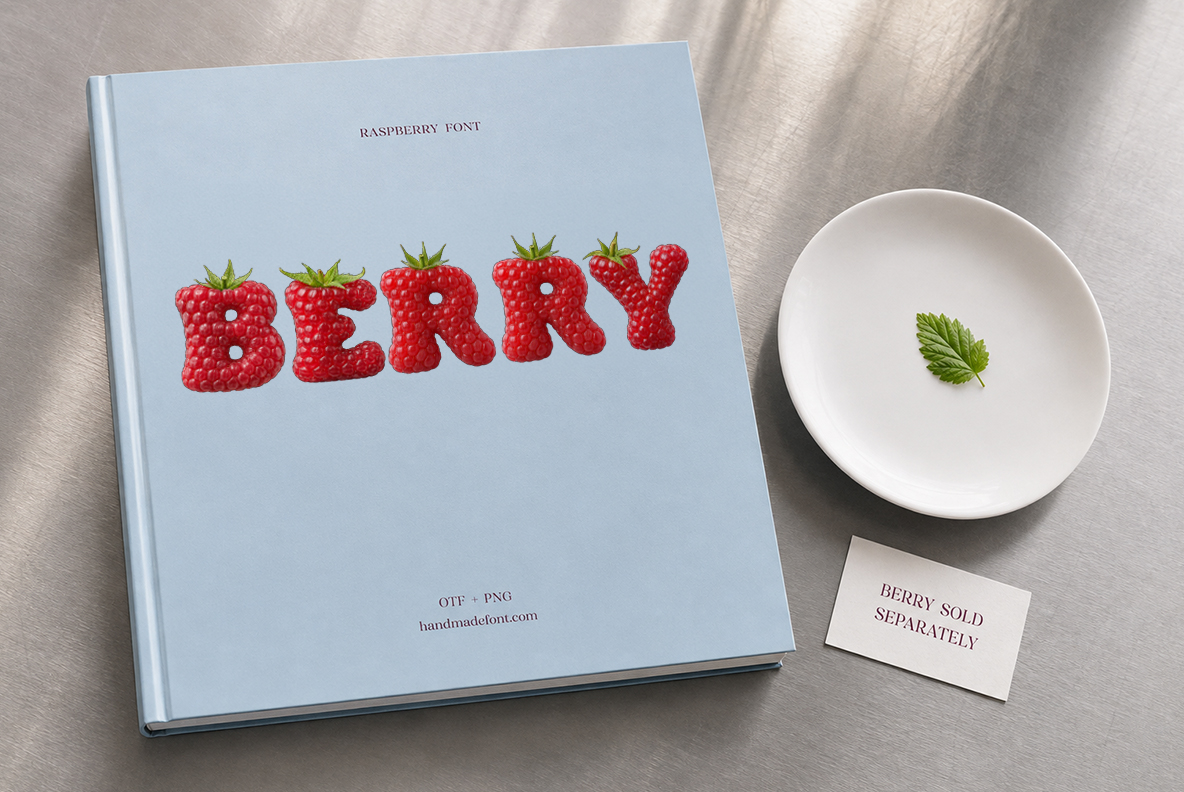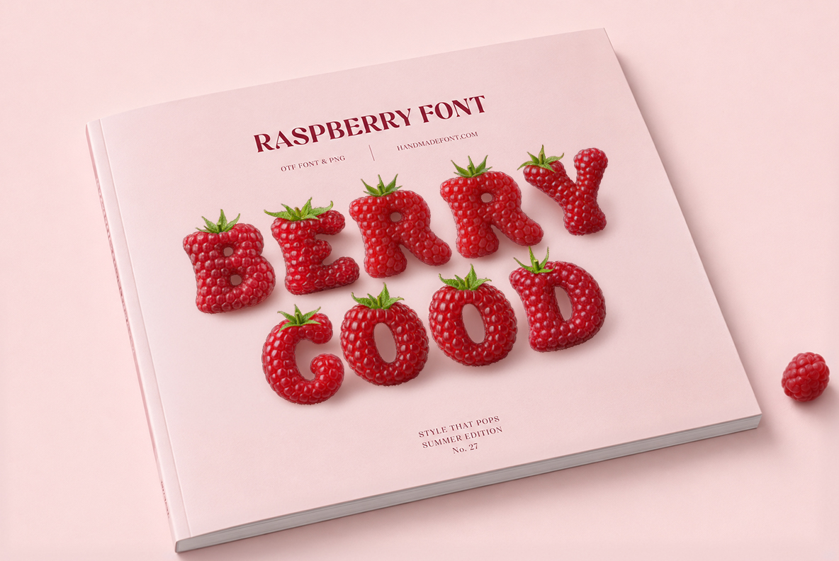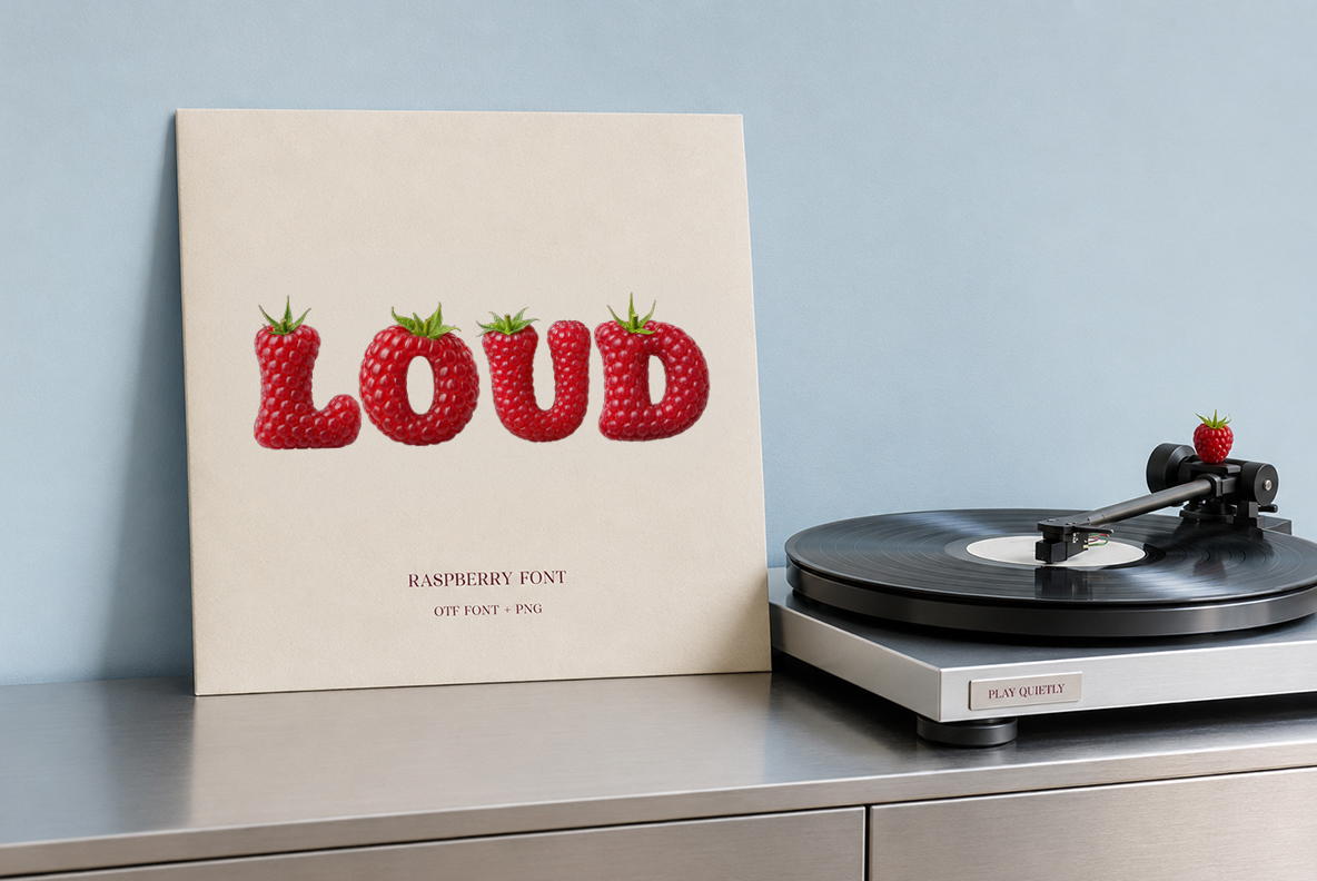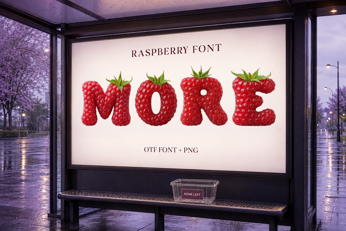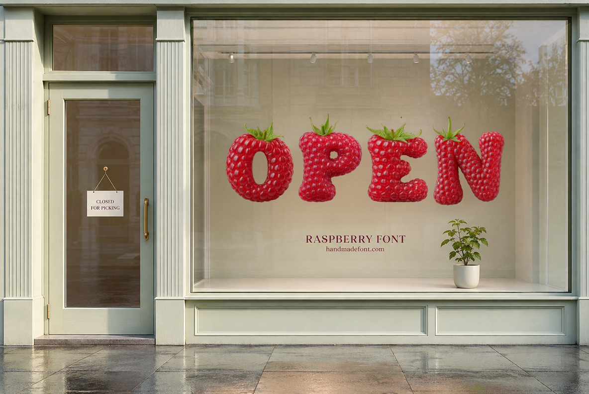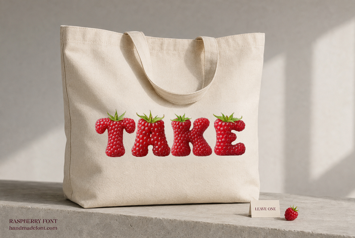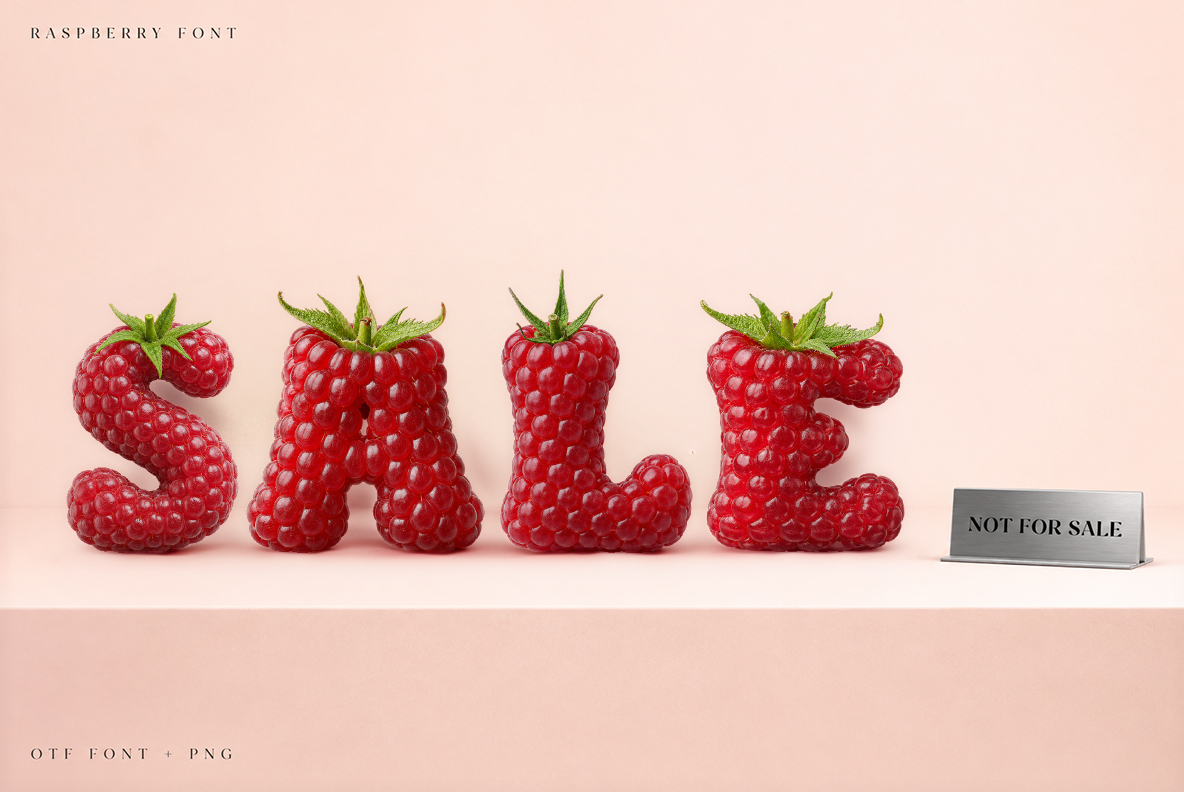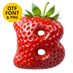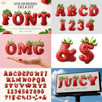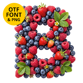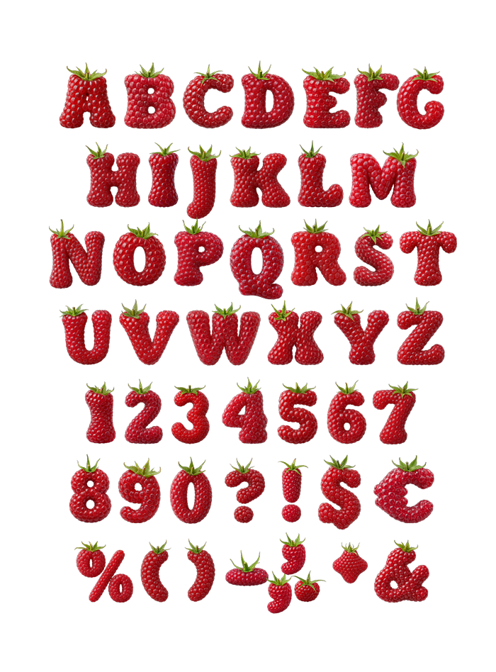
Hundreds of tiny drupelets packed across every stroke, deep dusty red and completely matte, with a small green calyx sitting on top of most capitals. Raspberry Font keeps a proper display serif underneath the fruit. Uppercase, numbers and punctuation, plus separate PNG letters. Made for jam jars, dessert menus, cosmetics and summer print. Numbers and punctuation are covered too.
Raspberry Font Is All Bumps and No Gloss
A raspberry is not one smooth skin, since it is a cluster of tiny beads packed together. That is exactly what covers every letter here. Hundreds of small drupelets bulge across the strokes, and each one catches its own highlight. Because the surface stays matte, the red reads deep and dusty rather than shiny. Meanwhile a small green calyx perches on top of most capitals.
A Serif Under the Fruit
Strip the berries away, and a proper display serif is holding everything up. Bracketed feet and thick-thin contrast keep the shapes disciplined. Since the texture is so busy, that discipline matters more than usual. So a headline stays readable even at modest sizes. Zoom right in, though, and it dissolves into fruit again. Besides, no two letters carry the same bead pattern.