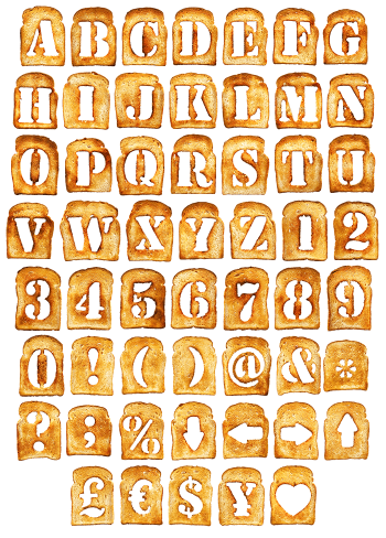
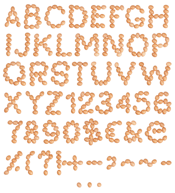
Fried eggs set into letterforms, with wide frilly whites, browned lacy rims and whole glossy yolks. The Fried Eggs Font covers letters, numbers and punctuation, and those round yolks fill the counters neatly. Mockups run from a brick wall billboard to posters, a t-shirt and a book cover. Supplied as an OTF plus transparent PNG letters.
Whites With Lacy Edges, Yolks Left Whole
Of course, each glyph is a fried egg that set into the shape of a letter. Whites spread wide and frilly, and the rims went brown and lacy in the pan. Yolks then sit whole and glossy on top, one or two per character depending on width. Because the whites stay slightly translucent, you can see where the heat caught them. Besides, no two letters cook the same way, and that is half the appeal.
The Fried Eggs Font Runs on Two Colours
Cream and orange do all the work here, and nothing else is needed. So the letters pop against teal, plum, pink, black or bare brick without an outline. Also the round yolks act as natural counters, filling the holes in B, O and A. Meanwhile the ragged silhouettes stop the alphabet from looking machine-made. The Fried Eggs Font therefore looks like breakfast that happened to spell something.