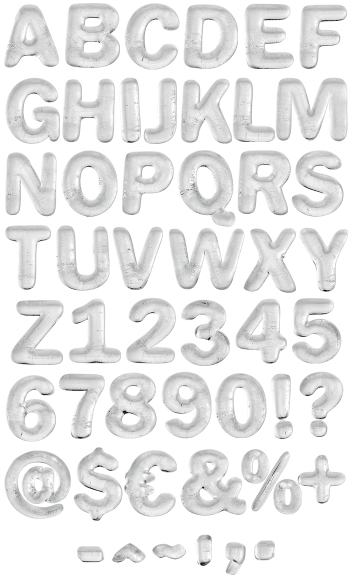
Snowball Font presses fresh snow into fat rounded letters, so every glyph keeps a granular white crust on top and a cold blue shadow underneath. Because nothing here cracks or spikes, the alphabet stays soft and friendly rather than icy. The counters are wide, and the OTF plus transparent PNG files ship together.
Snowball Font Packs Snow Into Fat Letters
Snowball Font presses fresh snow into each character the way you would pack a snowball in your hands, so the corners round off and the surface stays granular. Because the crust sits crisp and slightly crumbly, the letters catch light in tiny flecks rather than one flat sheen. Meanwhile the underside falls away into cold blue shadow, which gives every glyph real weight. So the alphabet reads as snow, not as white paint.
White Crust Over Cold Blue Shadow
The skeleton is a fat rounded slab with wide counters, so it stays legible even when the snow softens the edges. Since nothing cracks and nothing spikes, this set feels friendly where most winter fonts feel sharp. Besides, the blue in the shadows keeps the white from disappearing on a pale layout. Meanwhile the numerals carry the same packed crust, so dates and prices match the headline.