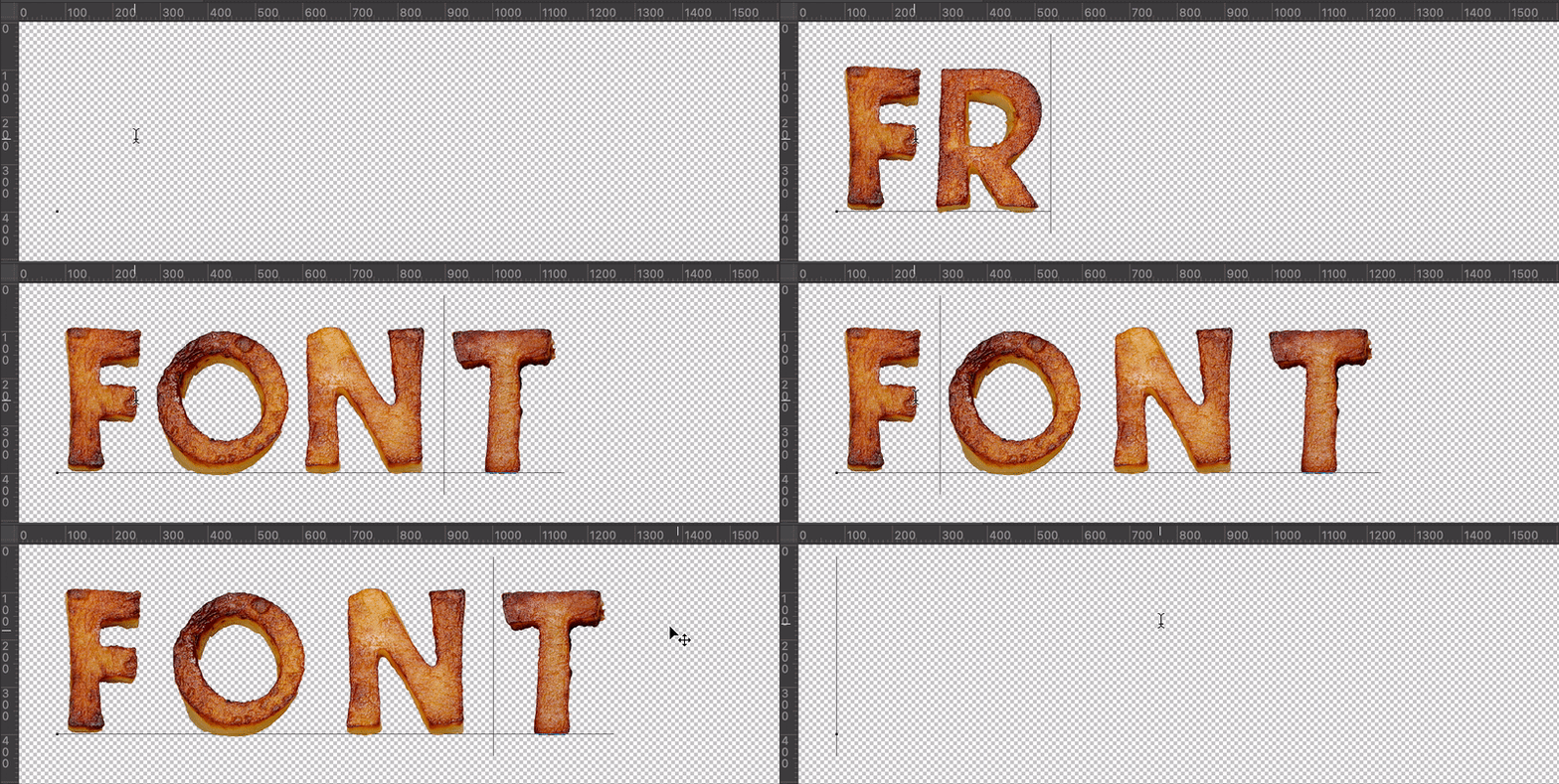
Fried Potatoes Font turns crisp golden fries into a playful display alphabet made for menus, snack packaging, food festivals, restaurant promotions, cookbooks, and cheerful social graphics. Every letter looks freshly fried, satisfyingly uneven, and almost too edible to typeset. Add ketchup if you like, but keep it away from the keyboard.
A Crispy Alphabet with Plenty of Flavor
Fried Potatoes Font shapes golden fried potato pieces into chunky, appetizing characters. Their toasted edges and handmade irregularity give headlines the warmth of comfort food without turning the layout into a greasy paper bag. It is playful, tactile, and immediately recognizable—ideal when your message should feel friendly rather than formally plated. The photographic texture makes each word feel physical, while the consistent golden palette holds the alphabet together. Even a simple title arrives with the confidence of a fresh basket placed in the middle of the table.