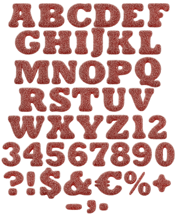
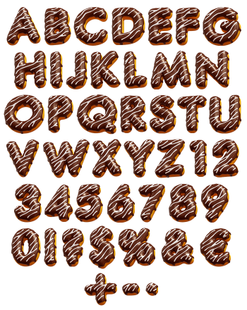
Raspberry shells, a pale cream layer and that ruffled foot round the join. Every letter is assembled like the pastry itself, matte crust and all, then shot close enough to see the sugar. The shapes are round and fat, with corners nowhere in sight. Sweet without tipping into cartoon, which is a harder trick than it sounds.
Two Shells and a Layer of Cream
Each letter is built the way the pastry is built. Two raspberry-pink shells, a pale cream filling pressed between them, and the ruffled foot running round the join. The crust is matte and faintly sugary, so it carries the slight sheen that comes off a fresh shell. Because the filling sits proud at the seam, the letters read as stacked rather than solid. A word therefore looks like a tray of them lined up.
The Macaron Font Is Softer Than It Looks
Roundness is the whole argument. The Macaron Font runs on a geometric sans skeleton with fat strokes and barely any counter to spare, which is what lets each glyph read as a pastry instead of an outline. Corners are gone entirely. Even the ampersand and the percent sign got the treatment, and they survived it. Above all the pink stays consistent across every character, so nothing looks colour-shifted when a line runs long.