Disco Pop Font. When Fonts Go Full Glam

49.00

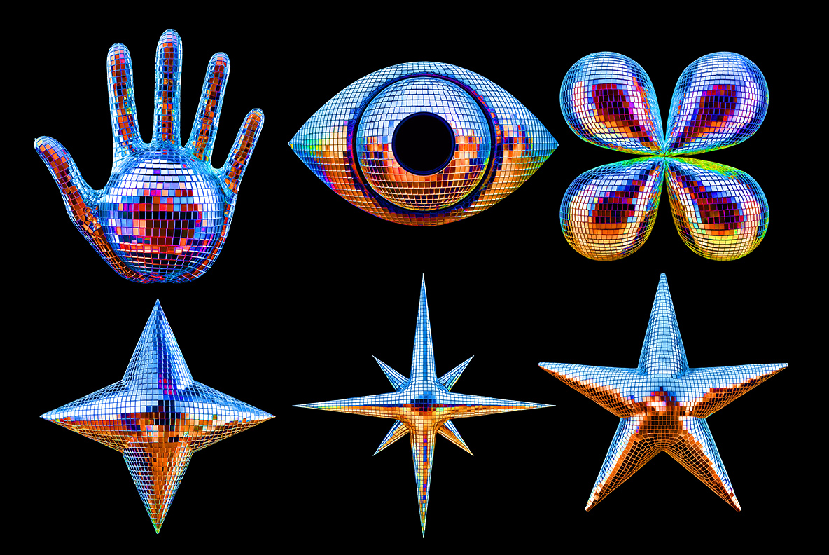
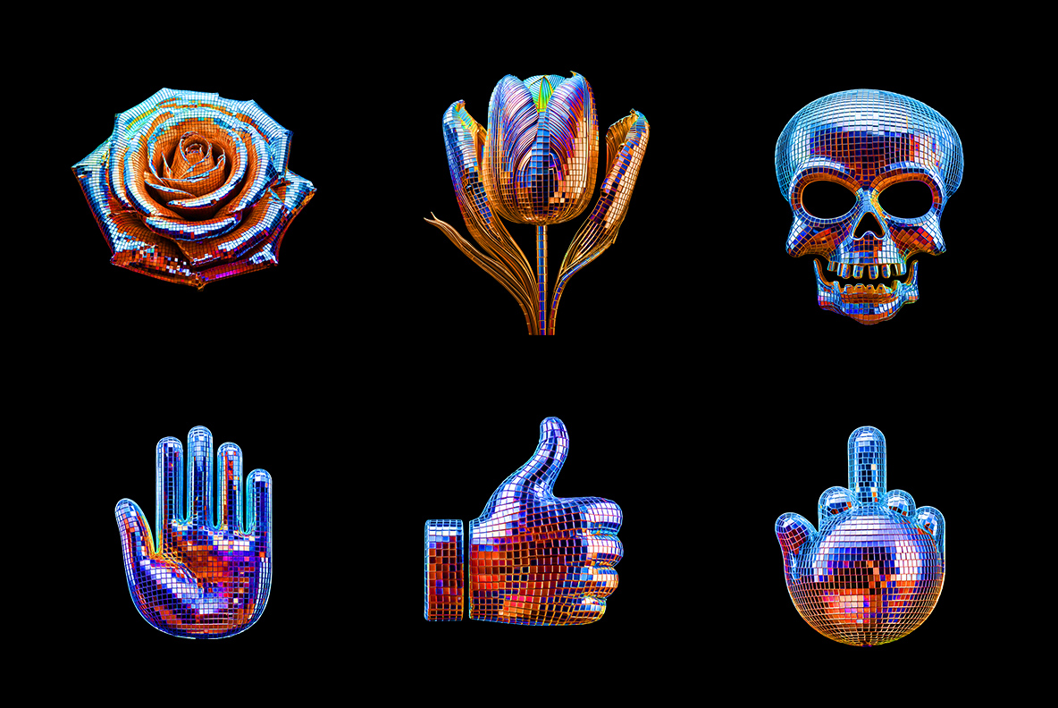
Disco-Pop Font is a vibrant, mirror-tiled typeface that captures the spirit of the dance floor. Each letter gleams like a 70s disco ball, with glossy, inflated curves and multicolored reflections. It’s bold, flashy, and unapologetically fun—perfect for party invites, music promos, or any design craving retro sparkle and attitude.

Licenses:

Product price
Additional options total:
Order total:
  
Don't forget about our exclusive deal!
  5 Fonts-30% OFF   🔥   10 Fonts-50% OFF  

Typography That Sparkles Like It Means It.

Disco-Pop Font isn’t just a typeface — it’s a Saturday night fever, a graphic confetti cannon, a glitter-drenched love letter to everything loud, bold, and unapologetically fabulous. This is the font that throws its own dance party the moment you hit the “F” key. Think Studio 54 meets digital design — minus the velvet rope, but with all the sparkle.

Each letter is a rounded, pillow-like form wrapped in tiny reflective tiles, like a disco ball that morphed into typography after one too many cocktails. The mosaic effect catches the light in all the right ways, bouncing color and joy off every glyph. It’s glossy, inflated, and a little extra — in the best possible way. If fonts had personalities, Disco-Pop would be the one doing the moonwalk across your screen wearing rhinestone boots.

Disco Ball Alphabet

Letters That Glow Harder Than Your Friday Night.

Let’s talk texture. This typeface isn’t flat. Oh no. It has presence. It has curves. It’s the typographic version of someone who enters a room and immediately becomes the center of attention — not because they’re trying too hard, but because they just are. The mirrored tiles create a hypnotic rhythm, a pixelated shimmer that flirts with your inner maximalist. This font doesn’t whisper. It sings. Loudly. In falsetto.

Disco-Pop Open-Type Font description

The Disco-Pop Font is a high-resolution OpenType typeface that includes uppercase letters, numbers, and basic punctuation, with each character measuring approximately 800 pixels in height. A full preview of the available letters and glyphs is included for your reference.

This color OpenType font is intended for use in applications that support color bitmap fonts. For optimal performance, programs like Photoshop, Illustrator, and Procreate are recommended. Being in the widely accepted OpenType format, the font is also compatible with other popular software such as InDesign, QuarkXPress, Keynote, PowerPoint, Word, and more.

Additionally, each character is provided as a separate PNG file with a transparent background, boasting a high resolution of 4000×4000 pixels. The download package includes 83 individual files—one for each character in the Disco-Pop Font set—giving you the flexibility to arrange the letters manually in any graphic design software for fully customized text compositions.

Disco Ball Alphabet
Disco Ball Alphabet
Disco Ball Alphabet
Disco Ball Alphabet
Disco Ball Alphabet
Disco Ball Alphabet
Disco Ball Alphabet

Bolder Than Glitter. Louder Than Neon.

From a design standpoint, Disco-Pop is a masterclass in controlled chaos. It balances the exaggerated playfulness of pop art with the meticulous structure of modular type. You’ll find nods to the aesthetics of Jeff Koons, Yayoi Kusama, and even the Memphis Group — all wrapped in a shiny, animated shell. And let’s be honest: in a sea of clean sans-serifs and beige branding, sometimes what you really need is a font that looks like it got dressed for Eurovision.

Use it for headlines, event posters, party invites, music branding, fashion statements, or anything that needs a healthy dose of “look at me now.” But beware: Disco-Pop doesn’t play nice in body copy. It’s a diva, not a paragraph font. Give it the stage, the lights, the attention it deserves.

What makes this typeface even more interesting is its perfect tension between retro and now. It feels like the 70s and 80s had a secret baby with a 2025 Instagram filter. You can practically hear the funky basslines and synth-pop drops when you look at it. Disco-Pop doesn’t belong to a single era — it borrows from them all, remixing nostalgia into something deliciously modern.

Disco Ball Alphabet
Disco Ball Alphabet
Disco Ball Alphabet
Disco Ball Alphabet
Disco Ball Alphabet
Disco Ball Alphabet
Disco Ball Alphabet
Disco Ball Alphabet

Disco Isn’t Dead — It’s Just Typing.

Typography, at its best, communicates tone before you’ve even read a word. And Disco-Pop shouts its mood from the rooftop — bold, bright, and boogie-ready. It tells your audience: this brand doesn’t take itself too seriously. This campaign wants you to smile. This event has glitter, and you’re on the guest list.

And here’s the kicker — despite all its pizzazz, Disco-Pop still holds its own technically. Its forms are balanced, its spacing generous, and its readability surprisingly solid (as long as you’re not trying to typeset a legal contract with it). It may look like a novelty font, but underneath the shimmer, it’s got chops.

So go ahead — indulge. Add some sequins to your design. Let your layouts dance. With Disco-Pop Font, every project becomes a celebration, every title a spotlight moment. It’s not just a font. It’s an invitation to have fun, to be bold, and to turn the volume all the way up.

One letter dimensions:

~ 2900 x 2900 px

File Size:

354 Mb (.ZIP)

File Type:

PNG

Technics:

3d render

Updating…
  • No products in the cart.