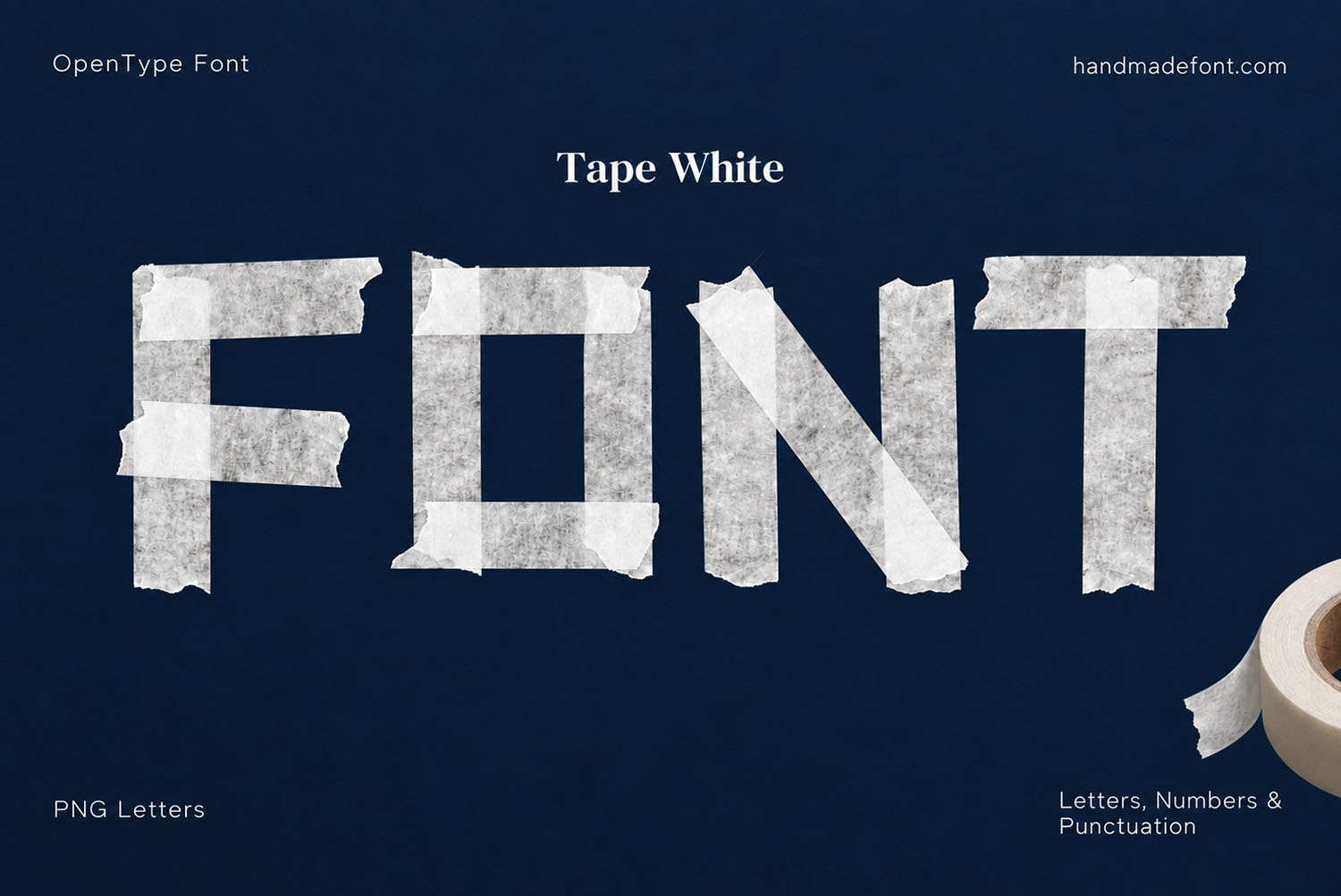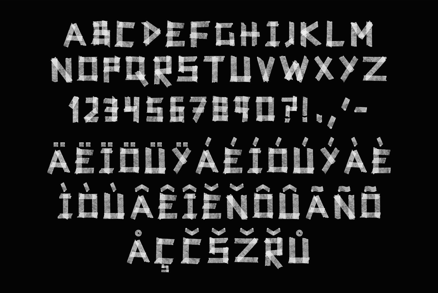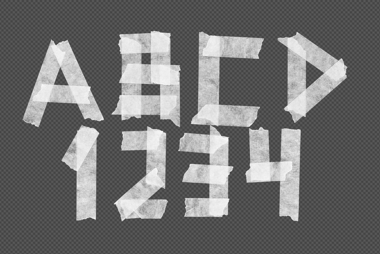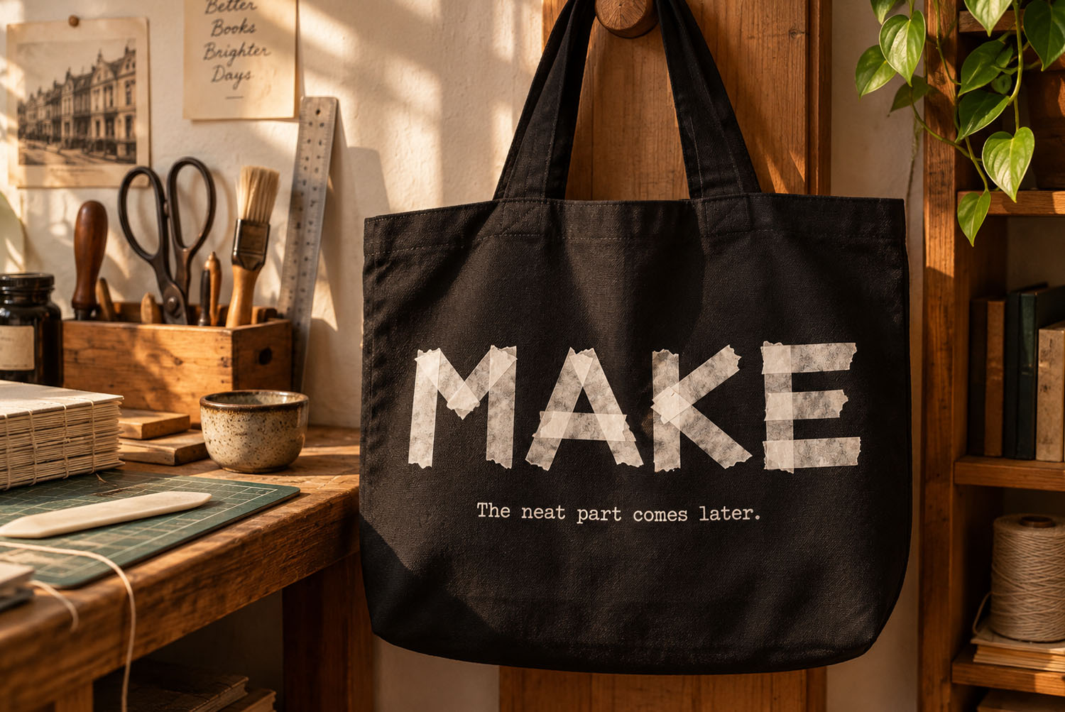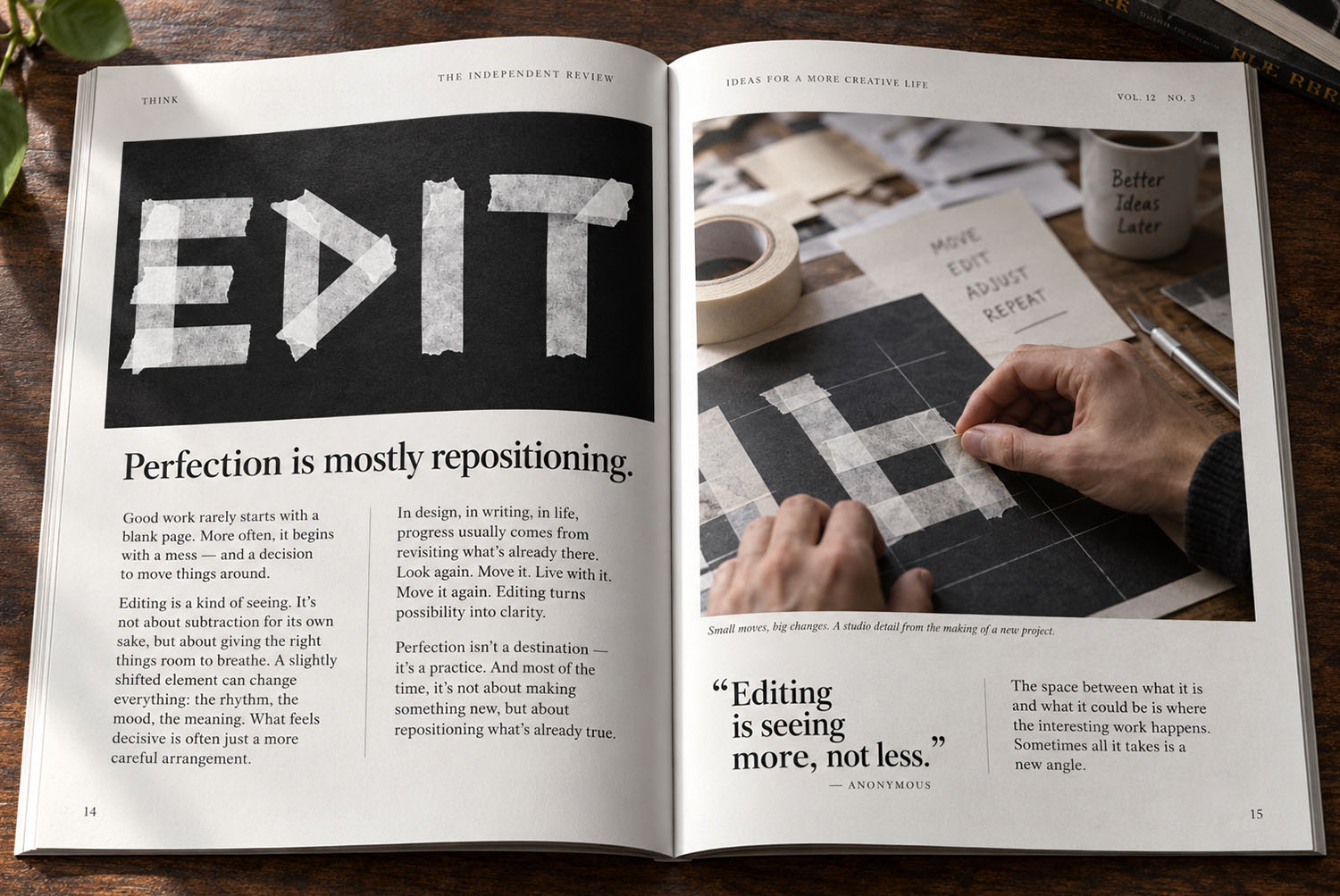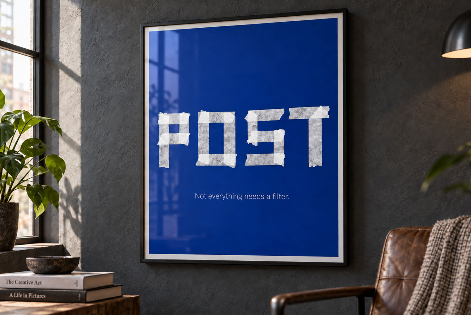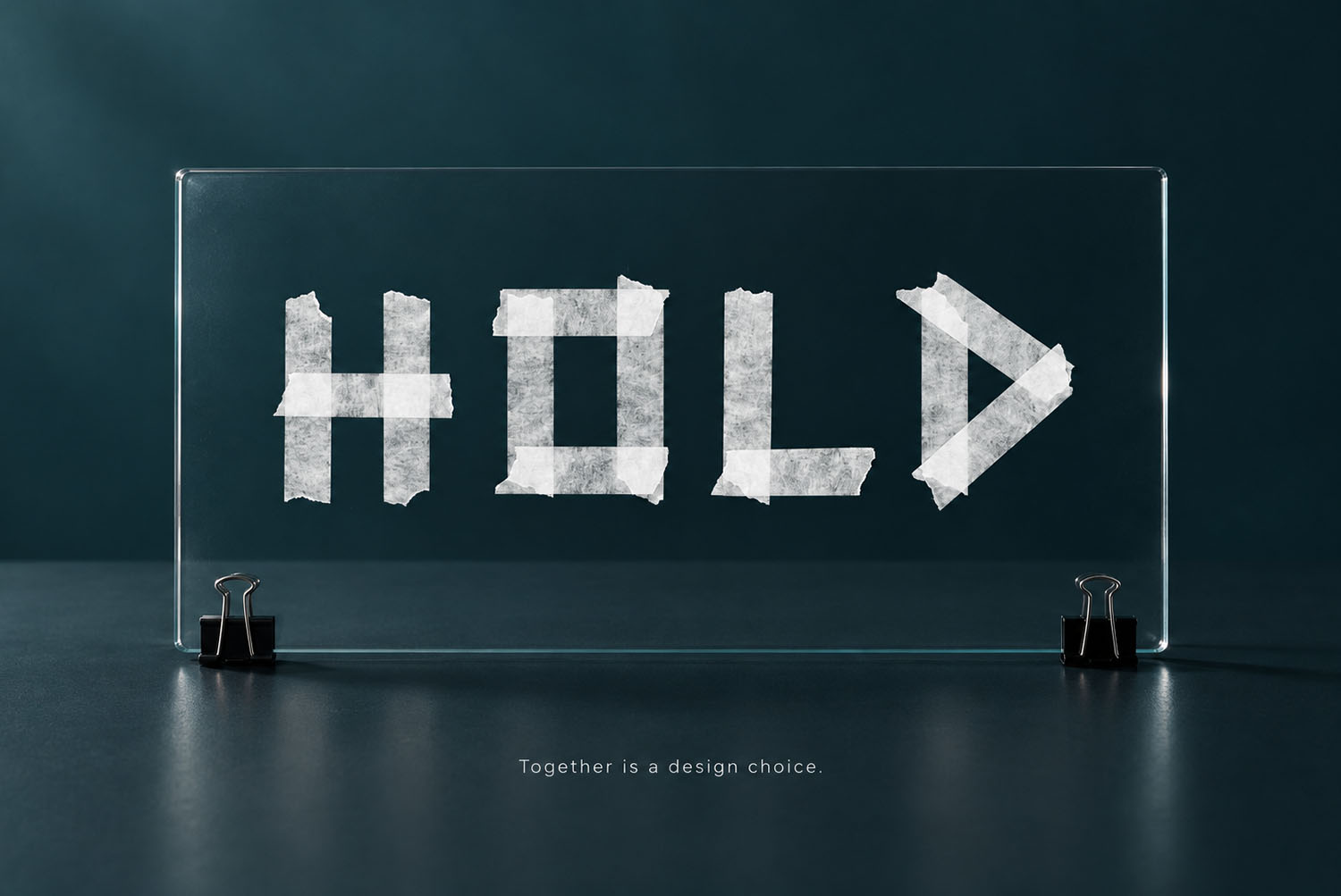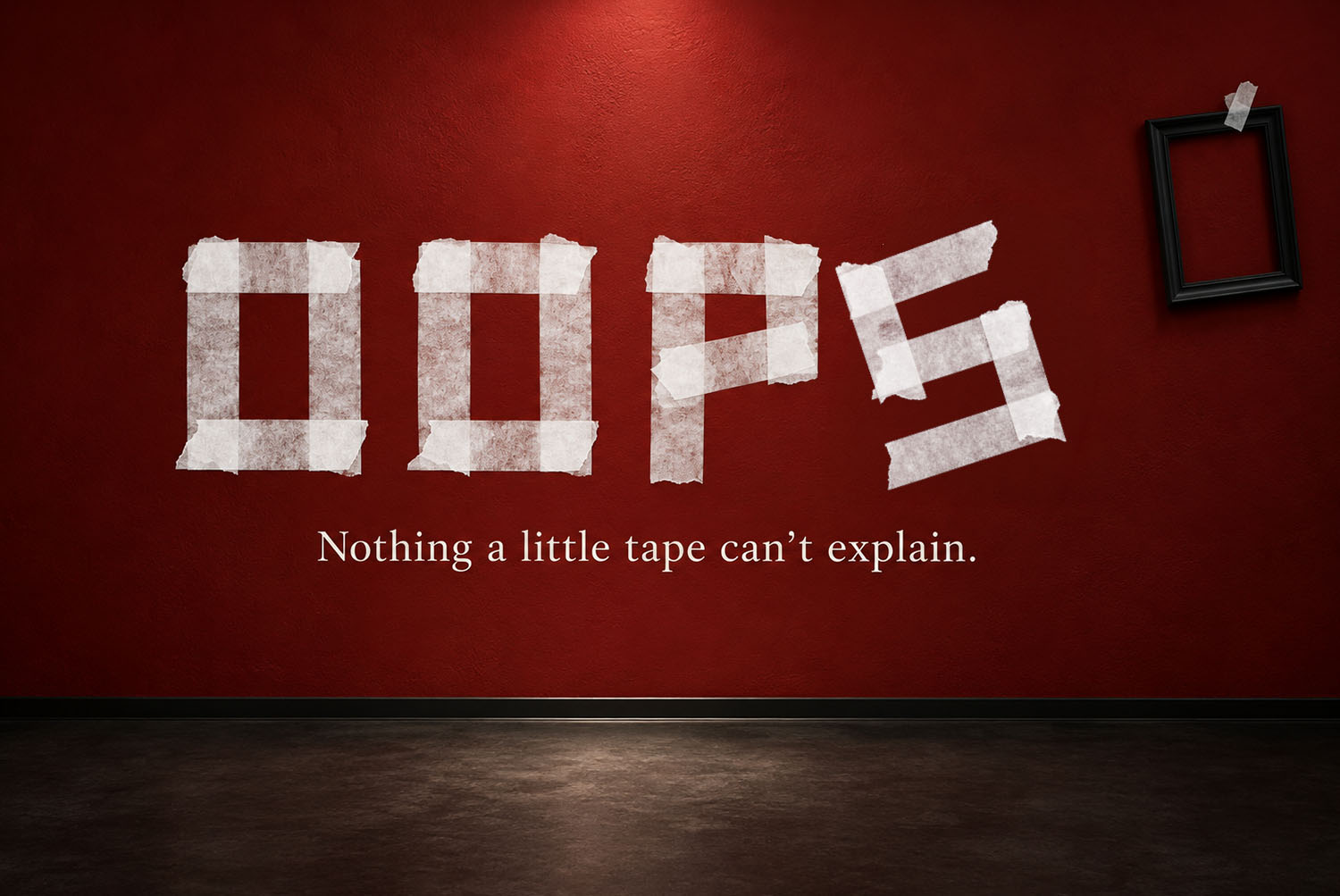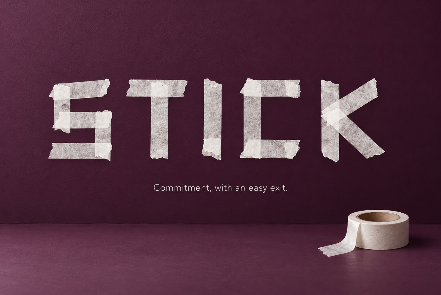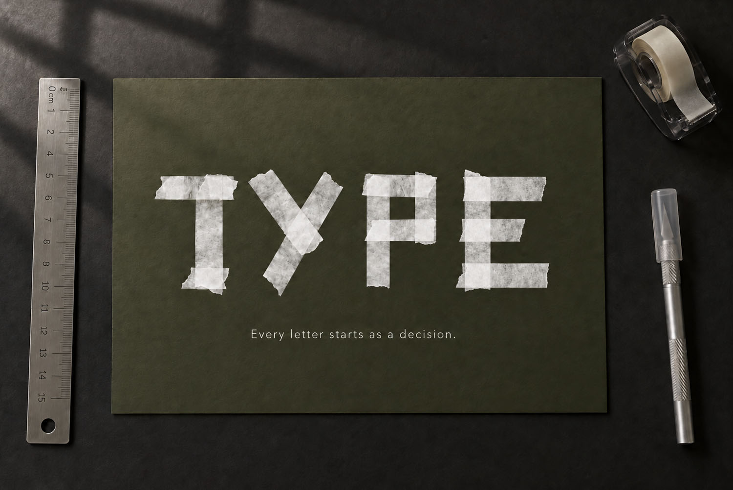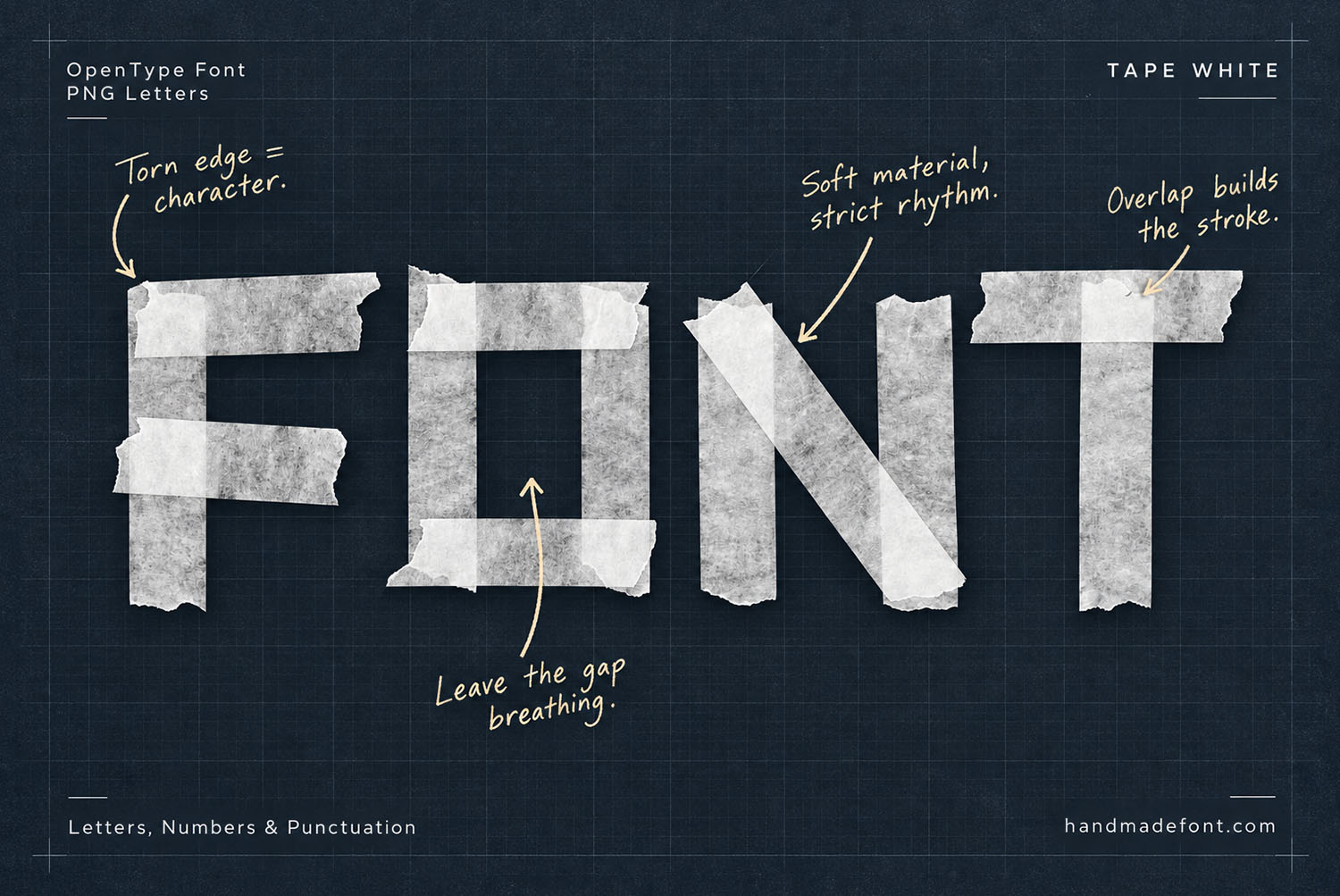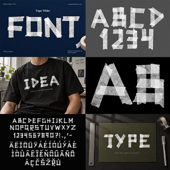
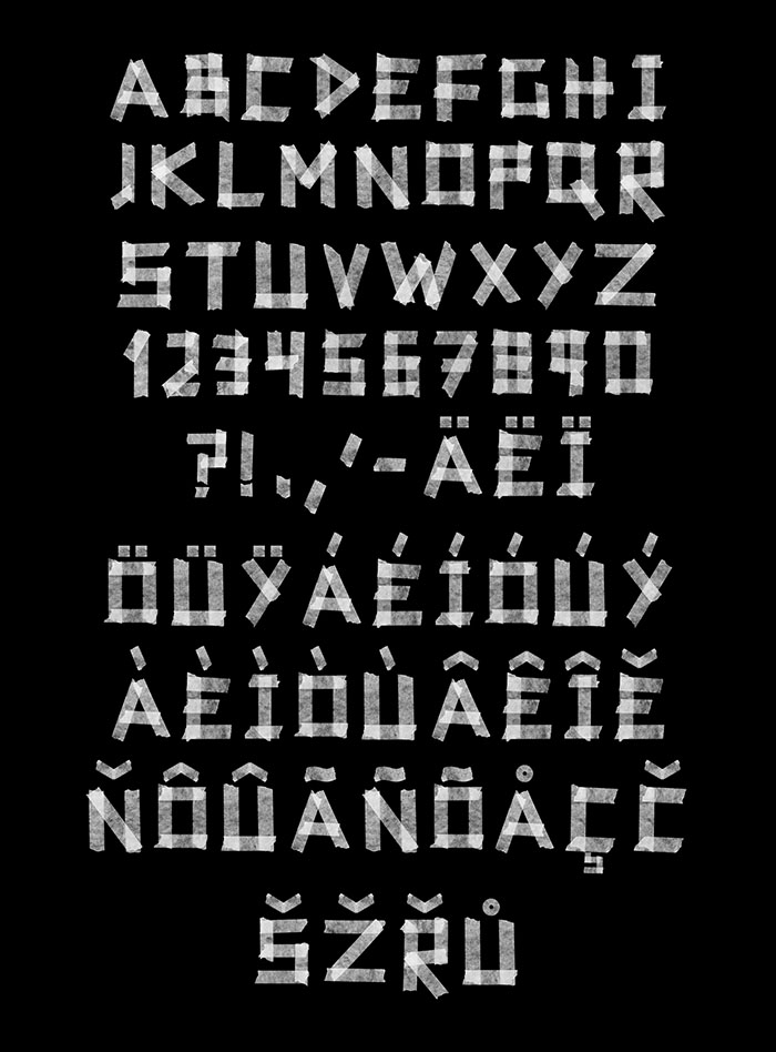
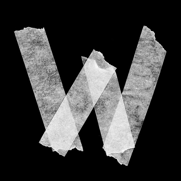
White masking tape, torn into strips and pressed straight onto black. Every letter of the Tape White Font is built from flat pieces, so the shapes stay angular and the torn ends stay ragged. Because the tape is translucent, this alphabet belongs on a dark background. Capitals, numerals, punctuation and a full accent set, as an OTF plus separate PNG letters.
Torn Strips, Not Drawn Curves
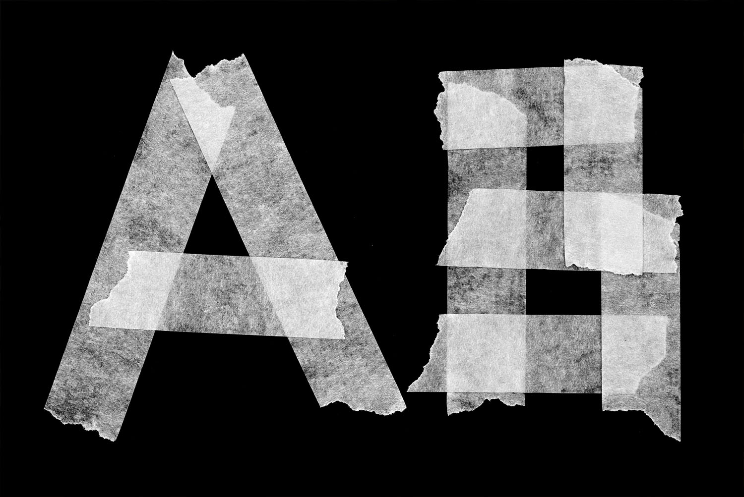
Each letter here is two or three pieces of tape, torn and pressed down. Tape comes in straight strips, so every shape ends up straight as well. For example, the O is a rectangle with corners, while the S turns in flat steps.
Torn ends stay ragged, because nothing was trimmed afterwards. Where one strip crosses another, the paper reads a shade denser, then lightens again. Of course, the fibre still runs through it.
The Tape White Font Wants a Dark Background
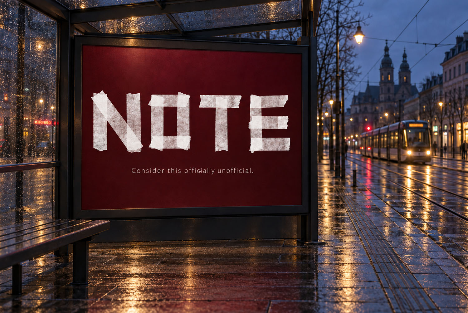
Masking tape is translucent, and that decides a lot. On white the letters nearly disappear, since paper and page share a tone. On black they light up instead, because the texture finally has something behind it.
So the preview above opens on a dark stage on purpose. Moreover, deep navy, charcoal and warm brown all work. Meanwhile a pale background is the one place this alphabet has nothing to push against.