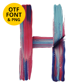
Smooth rounded tubes laid down in one pass, with a fine ribbed grain along each stroke and a gentle spectrum gradient flowing through them. Rainbow Font feels handwritten rather than painted. Uppercase, numbers and punctuation, plus separate PNG letters. Good for kids’ publishing, wellness brands, music covers and event print. Numbers and punctuation follow the same gradient.
Rainbow Font Is a Marker, Not a Brush
The strokes here are smooth rounded tubes, laid down in one confident pass. No bristle marks appear anywhere, since nothing was dragged. Instead a fine ribbed grain runs along each tube, which gives the colour something to sit on. Because the ends are blunt and rounded, the letters feel soft and friendly. So the whole alphabet reads closer to handwriting than to painting.
Gradient That Never Repeats
Colour flows through the spectrum along every stroke, and the transitions stay gentle. Since the palette is bright but not neon, the letters glow instead of shouting. Meanwhile the tubes overlap each other cleanly, which keeps busy shapes legible. Set it on black, and the gradient does the lighting for you. Besides, the ribbing gives the tubes a little body.