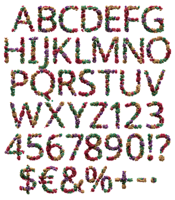
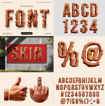
Hundreds of soft matte spheres in a warm skin tone, packed until they form letters. Each ball keeps its own shadow, so the cluster holds together at a distance and separates into parts up close. The colour sits deliberately close to human. Unsettling, tactile and very hard to walk past when it is blown up on a poster.
Letters Packed From Soft Spheres
Take a few hundred matte balls in a warm tan, press them into the shape of an A, and stop there. That is the method. Each sphere keeps its own soft shadow and a faint rim of light, so the cluster reads as a solid mass from a distance and falls apart into parts up close. Sizes vary across every letter, though. Because of that, nothing looks machine-packed, and the alphabet stays organic at any scale.
Why the Metaskin Font Feels Odd
Colour is what makes the Metaskin Font uncomfortable, and deliberately so. The tan sits close to human skin, a shade warmer than clay and a shade cooler than caramel, while the matte surface absorbs light instead of bouncing it. Some designers will find that repellent. The ones who want a reaction will find it exactly right. Naturally the spheres stay smooth and clean, which stops the whole thing tipping into gore.