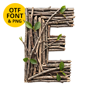
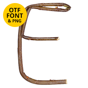
Thick dead branches, not delicate twigs. Two or three chunky pieces make up each letter, with bark still clinging along one side and pale wood showing where they snapped. Lichen has taken hold on a few. Nothing lines up neatly, so the whole alphabet leans and overlaps. It looks gathered rather than designed.
The Thick Pieces, Not the Thin Ones
Somebody went out and picked up the heavy pieces. Each letter uses two or three chunky dead branches, so the strokes come out lumpy and uneven. Bark clings along one side of most pieces, while the snapped ends show pale inner wood. Pale grey lichen has taken hold on a few of them, naturally. Colour sits between honey and grey-brown, because dry wood loses its warmth slowly. Above all the Dry Twigs (v2) Font wears every bit of that on the surface.
Rough Shapes That Still Read
Branches refuse to be straight, so no two strokes in the Dry Twigs (v2) Font match. Verticals lean slightly, crossbars sit where the wood allowed, and joints overlap instead of butting neatly. That looseness is the point, though it does make the letters wide. Counters stay big and open, since a cluttered bowl would read as firewood. Shadows fall under each overlapping piece, therefore the whole thing sits on the page as an object.