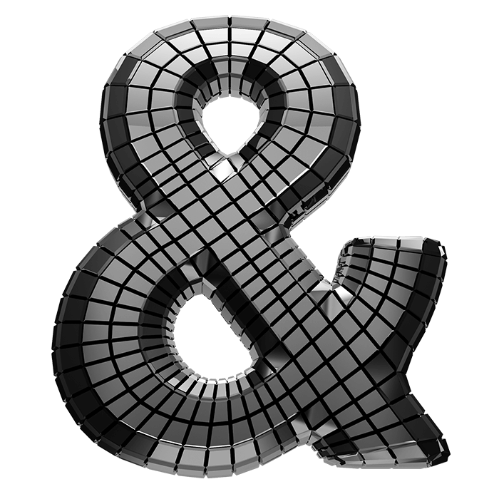

A heavy condensed grotesque wrapped in small mirrored facets, with the glare sliding across every curve. The Discoball Font keeps the wild chrome finish on a disciplined narrow skeleton, so headlines still pack tightly and read clean. Numerals, currency signs and punctuation follow the same tiling, and black backgrounds bring the whole thing alive.
Chrome Cut Into a Thousand Small Squares
A mirror ball is really just a sphere wearing tiles, and this alphabet borrows the trick. Fine square facets likewise wrap every stroke, following each curve like scales on a fish. The metal underneath runs from near-white highlight to deep charcoal shadow, so the letters look properly reflective. Small distortions appear inside each tile too, because a mirrored surface never shows a clean picture. Nothing has been flattened here, and the glare shifts as the shape turns.
Discoball Font Stays Tall and Narrow
The letterform itself, of course, is a heavy condensed grotesque rather than a balloon. Strokes stand upright and squared off, so headlines pack together tightly on a narrow flyer. That tension is worth noticing, though. A wild finish rides on a very disciplined skeleton, which is why the Discoball Font still reads at small sizes. Numerals, currency signs and punctuation also follow the same grid. Since the tiling scales with the glyph, small type never turns to mush.