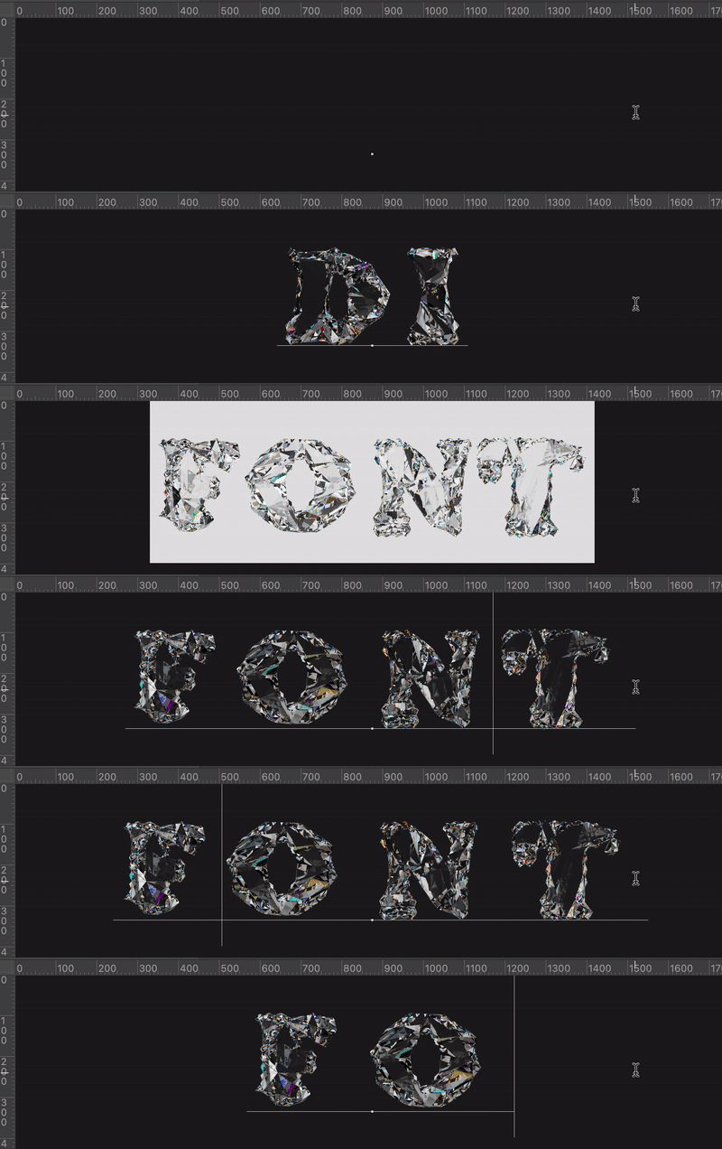
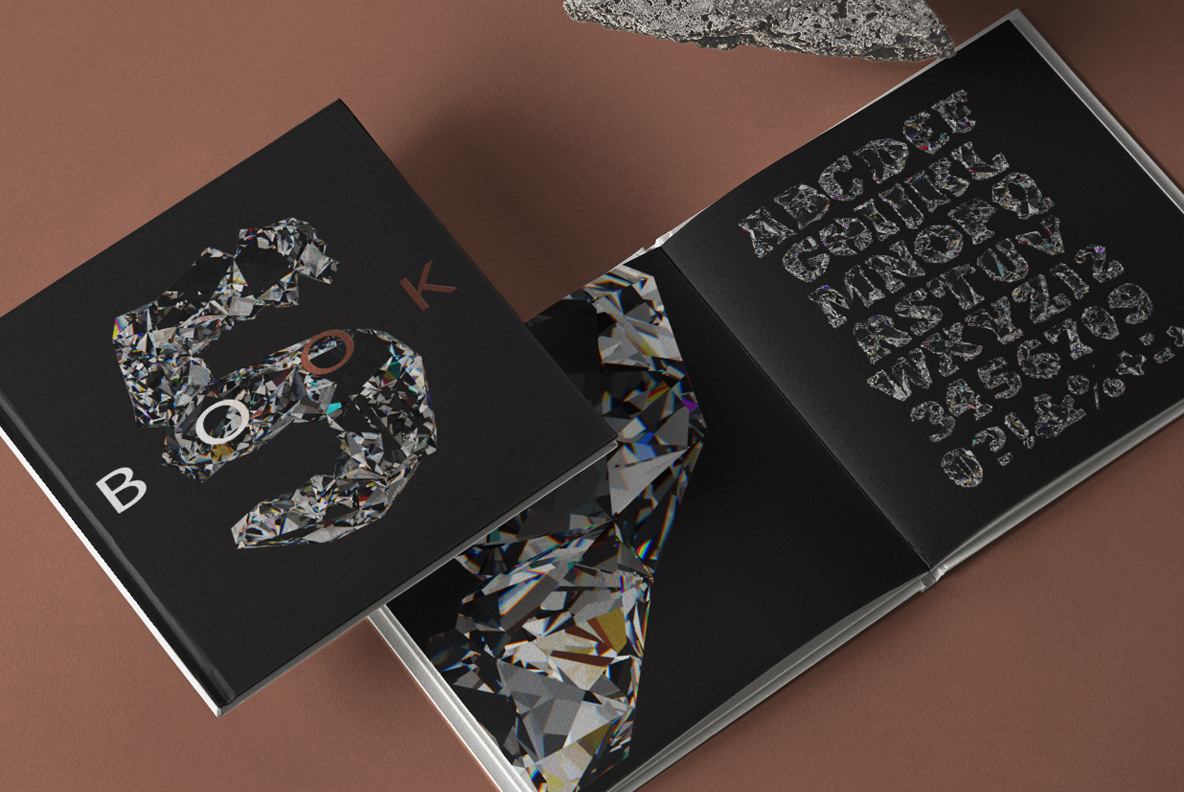
Black diamond, roughly cut. Every letter is a cluster of hard planes that meet at sharp angles, so light snaps from one facet to the next instead of gliding. Flashes of pink, green and blue fire hide in the deeper cuts. The stone is dark enough to read as a silhouette, though the facets keep it alive.
Cut, Not Polished
A jeweller would reject every one of these stones, obviously. Facets meet at awkward angles, so the surface breaks light into hard shards. Chips have flaked away along the edges, while whole planes sit slightly out of true. Nothing is symmetrical, since real crystal never grows to a plan. Deep black dominates, though thin rainbow flashes surface where the stone catches an edge. Above all the Diamo Font keeps that raw, straight-from-the-mine roughness.
Light Doing the Heavy Lifting
Dark letters risk turning into shapeless blobs, so the Diamo Font puts bright specular lines along every facet edge. Those catch lines describe the form when the black itself cannot. Iridescence appears in small patches, therefore the eye finds colour without the letter turning colourful. Shadows inside the cuts go properly deep, since nothing bounces back out. Put the alphabet on white and it reads as a hard silhouette. On black it glitters instead.