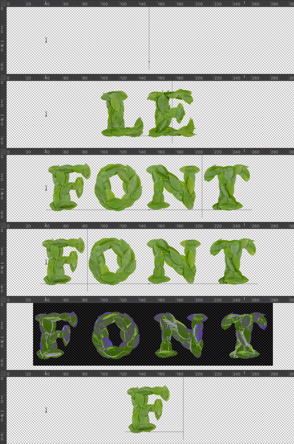
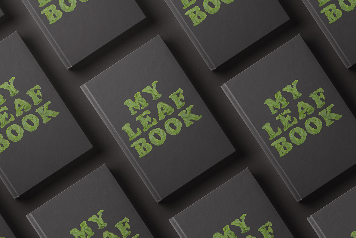
Somebody stripped a herb garden to spell something. Cooper Leaf Font lays fresh green leaves over one another for every stroke, edges curling away from the surface, veins showing across each blade and the greens shifting from yellow-lime to deep forest. It suits herbal tea, plant nurseries, vegan menus, skincare packaging and environmental campaigns.
Cooper Leaf Font Overlaps Real Foliage
Somebody stripped a herb garden to spell something. Fresh green leaves laid over one another build every stroke of the Cooper Leaf Font, so a letter becomes a run of overlapping ovals rather than a solid shape. Because the leaves keep their natural curl, the edges lift away from the surface and cast small shadows. Then veins show clearly across every blade. Meanwhile the greens shift from yellow-lime on the young leaves to deep forest on the older ones. Naturally a few tips have started to darken.
Veins, Curl and a Living Green
The material stays convincingly alive. Each leaf carries its own central rib with finer veins branching off, since that is what makes foliage read as real rather than cut from paper. The surfaces hold a soft sheen where they catch light. Besides that, the leaves overlap at varied angles, which keeps a word from looking stencilled. Likewise some edges show the faint serration of a real herb. Of course the letterforms stay simple underneath, because the foliage supplies all the complexity.