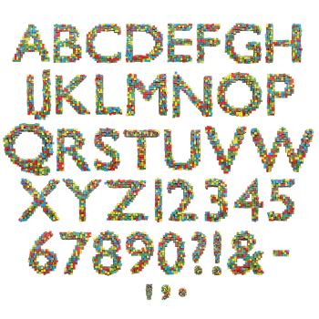
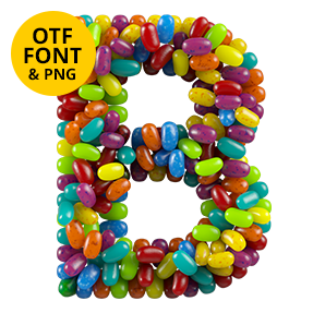
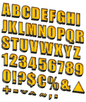
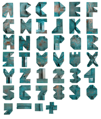
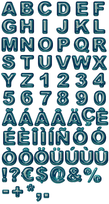
Imagine a fistful of drinking straws cut flat. Color Tubes Font bundles thin round tubes into every glyph, so the face becomes a mosaic of small circles while the edges show the same tubes as long glossy cylinders. The palette stays pink, violet, blue and cream. It suits creative agencies, stationery brands, print shops and design festivals.
Color Tubes Font Bundles Its Letters
Imagine a fistful of drinking straws cut flat. Every glyph in the Color Tubes Font is a dense bundle of thin round tubes seen end-on, so the face becomes a mosaic of small coloured circles. Because the bundle has depth, the tubes run back at an angle and show their long sides along each edge. Then the circles pack tight without ever lining up into a grid. Meanwhile the palette stays in pink, violet, blue and cream throughout. Naturally the outer tubes catch more light than the ones buried inside.
Round Ends, Long Sides, No Grid
The two views make the whole effect. Straight on you read circles, since that is the cut end of every tube. Turn to the edge, though, and the same tubes become long glossy cylinders. Besides that, each tube carries its own highlight running down its length. The colours repeat without a pattern, so no two letters read alike. Of course the bundle stays solid enough that the letterform never breaks up.