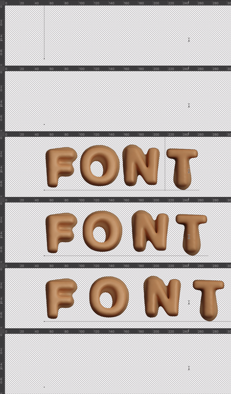
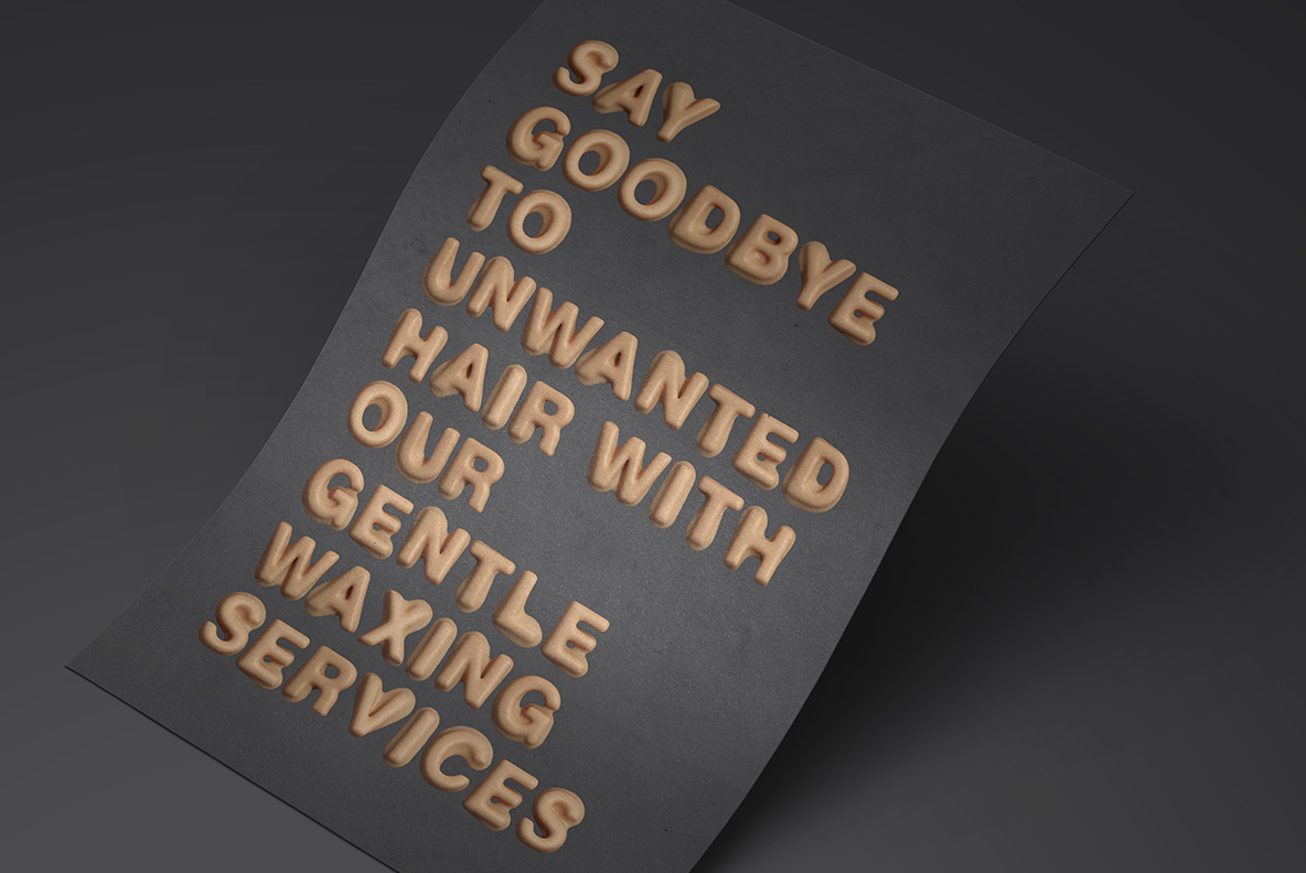
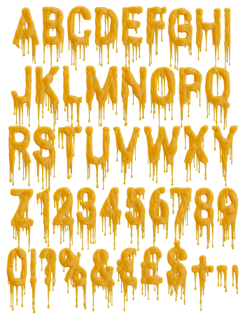
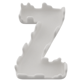
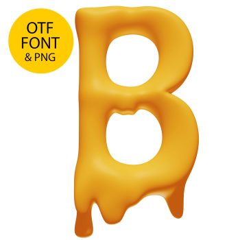
Fat rounded capitals that look rolled between warm palms: no sharp corners, a satin sheen and tips that droop as if the room got too warm. The beige-caramel tone reads as real candle wax rather than plastic. It suits beauty brands, playful packaging and covers that want something soft and slightly surreal.
Chubby letters with the give of soft wax
Each letter looks like it was rolled between warm palms, then pressed flat. The corners round off completely, so nothing here has a sharp edge. Strokes swell in the middle, meanwhile, and pinch slightly where they meet. Because the surface sags a little, the shapes feel heavy rather than inflated. A few tips even droop, as though the room got too warm. There is no bevel and no hard chamfer anywhere.
Skin-warm beige and a satin sheen
Colour does a lot of the work here. The tone sits between beige, caramel and bare skin, which reads as candle wax rather than plastic. Light rolls across the curves slowly, since the finish is satin instead of glossy. Shadows pool in the joints, too, and give each letter real weight. On black it glows softly, though on mint it turns almost edible.