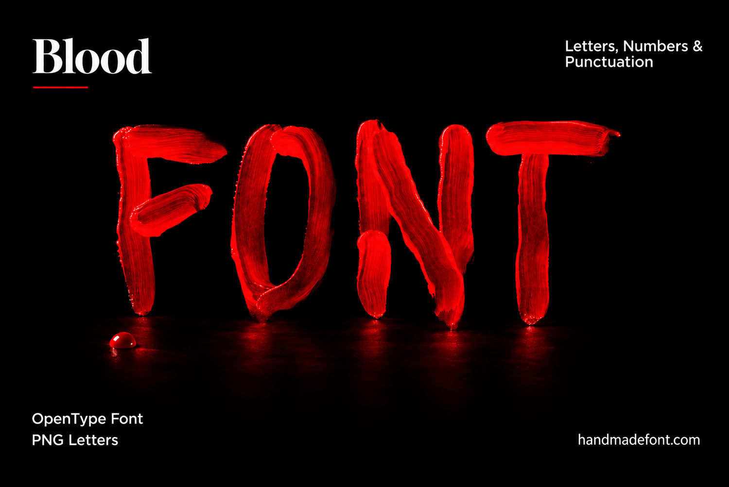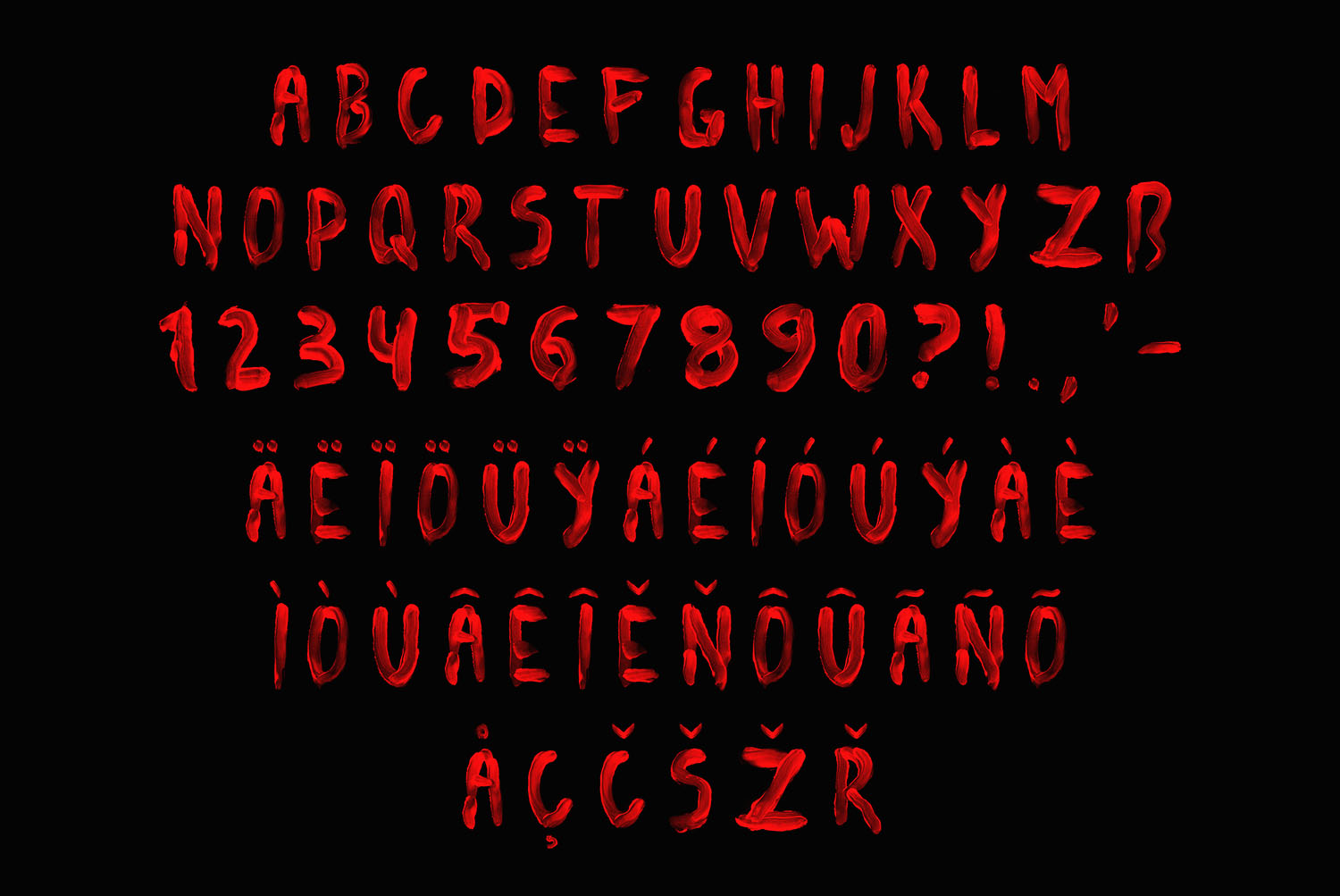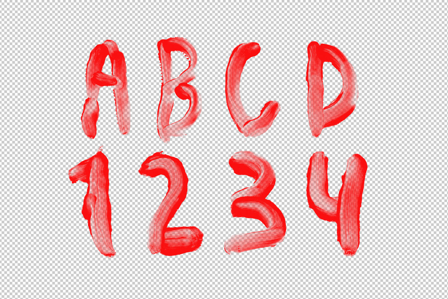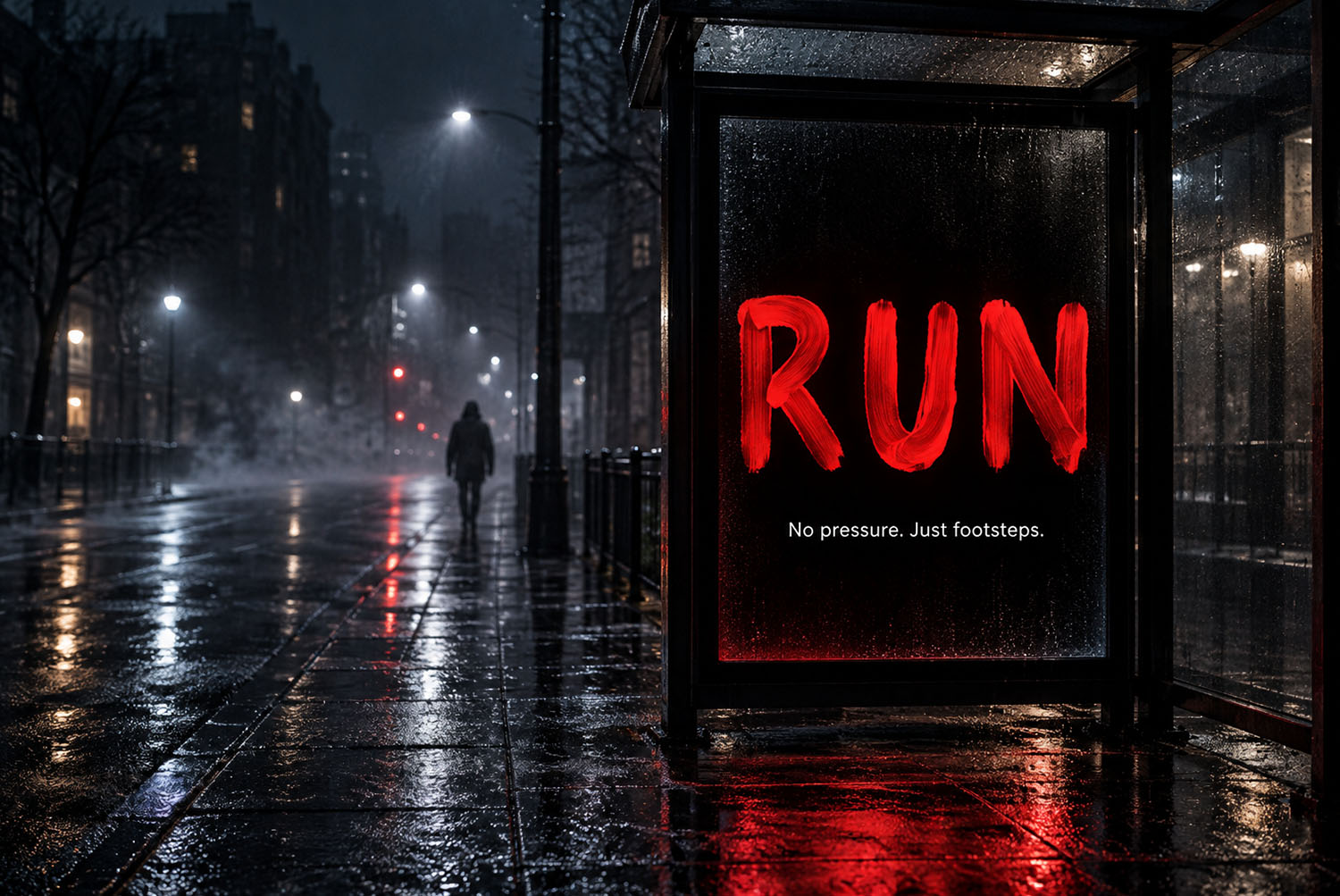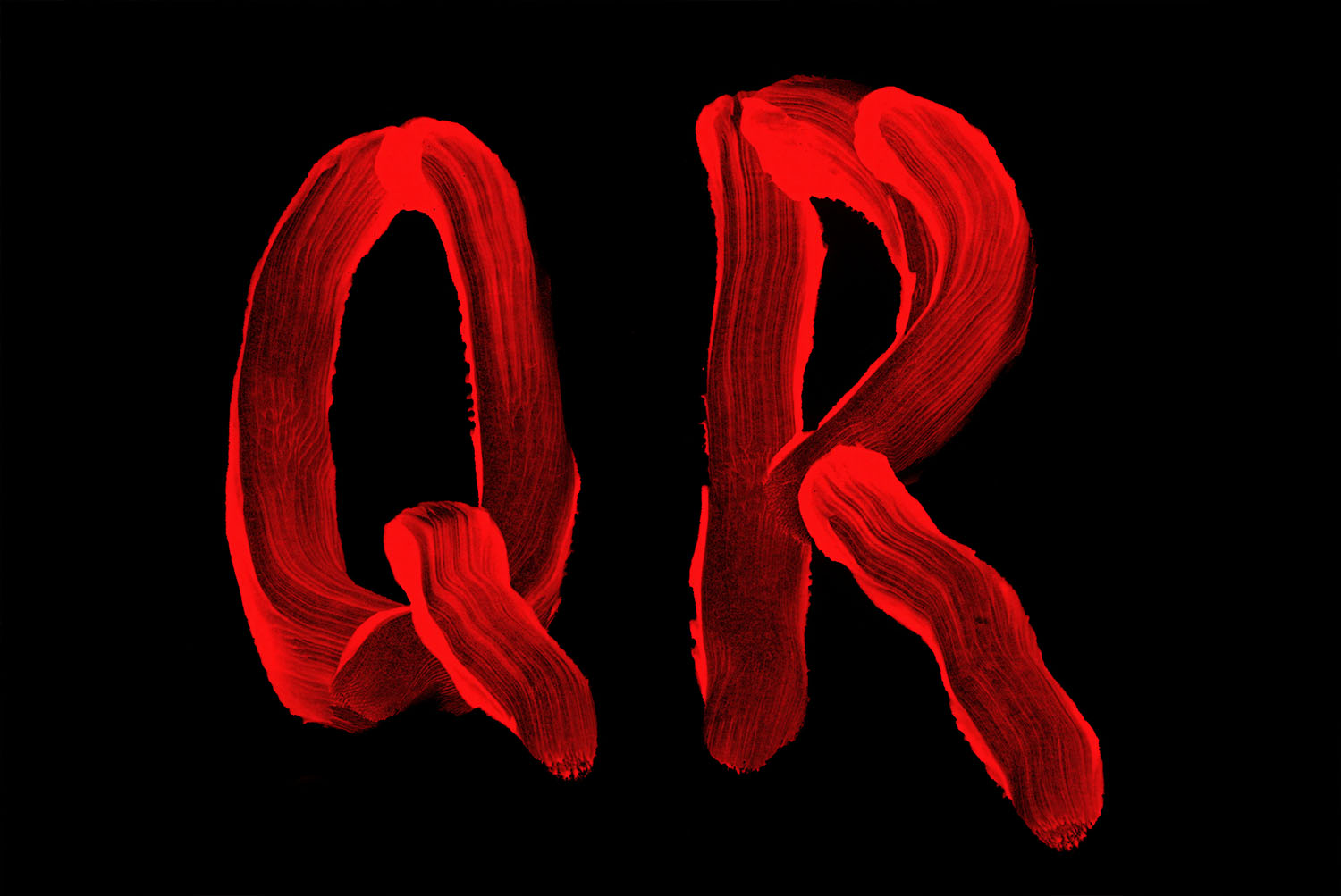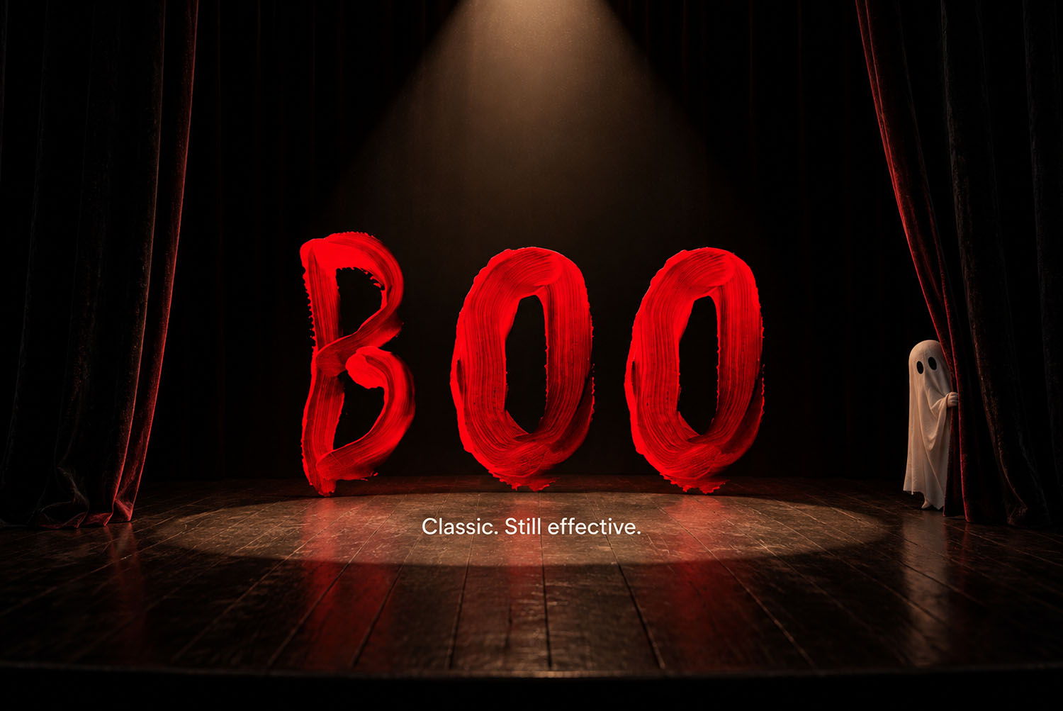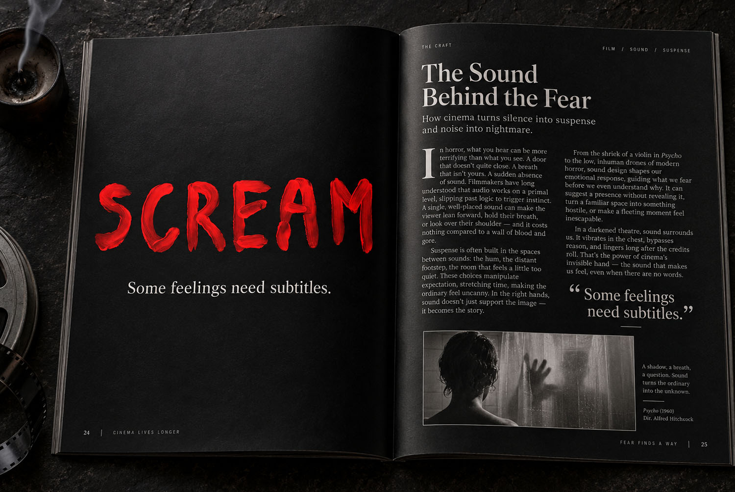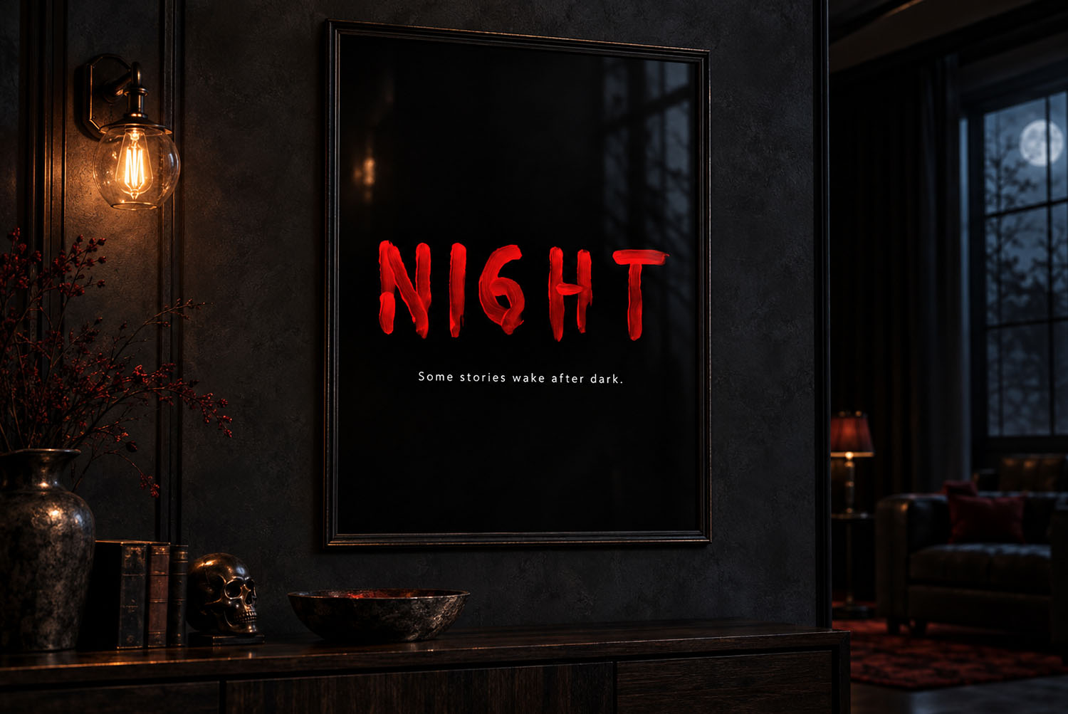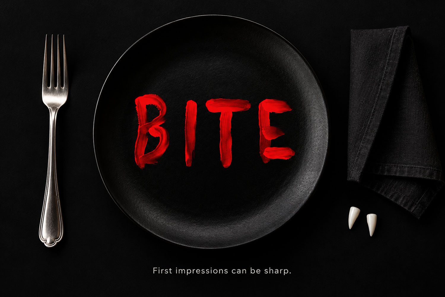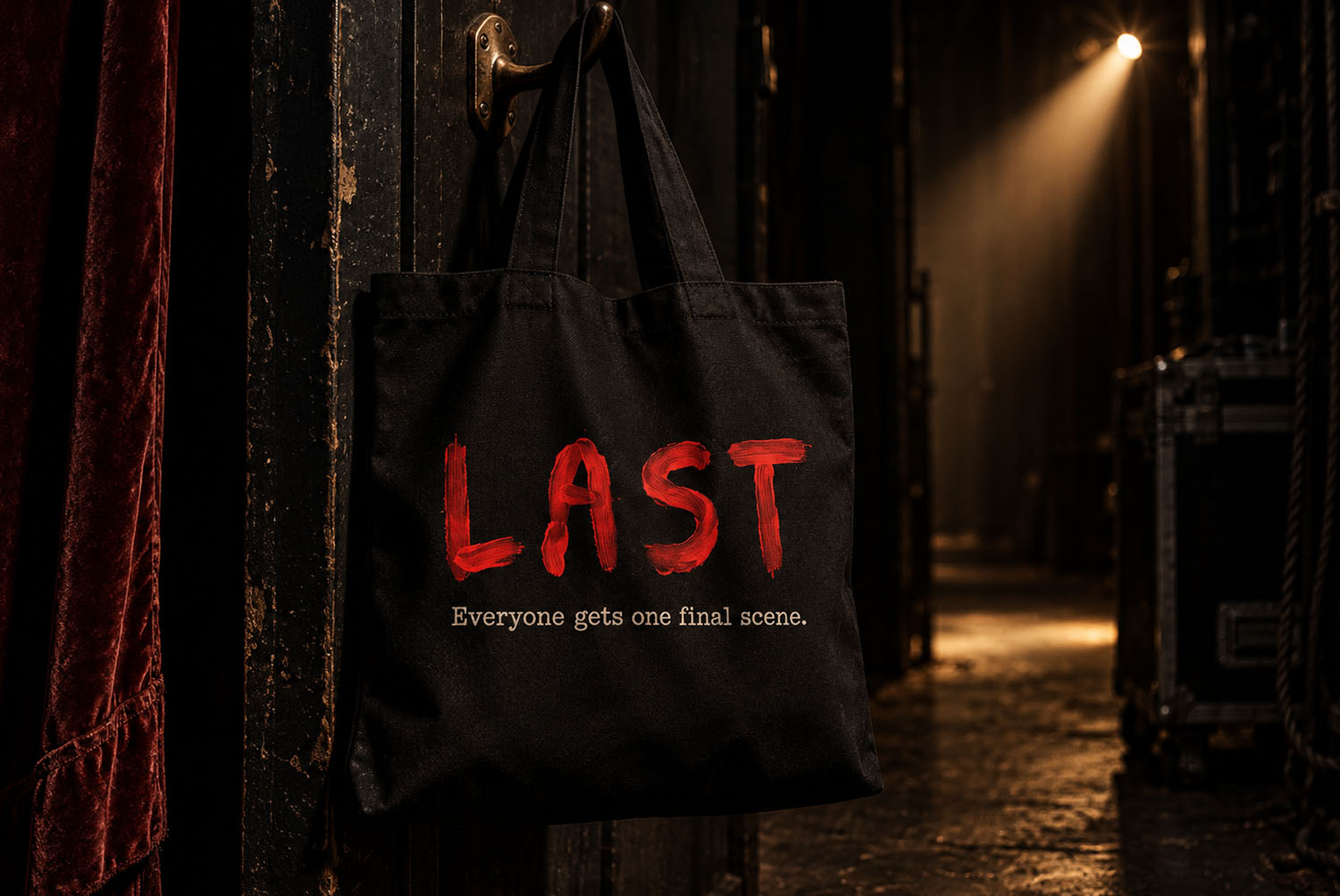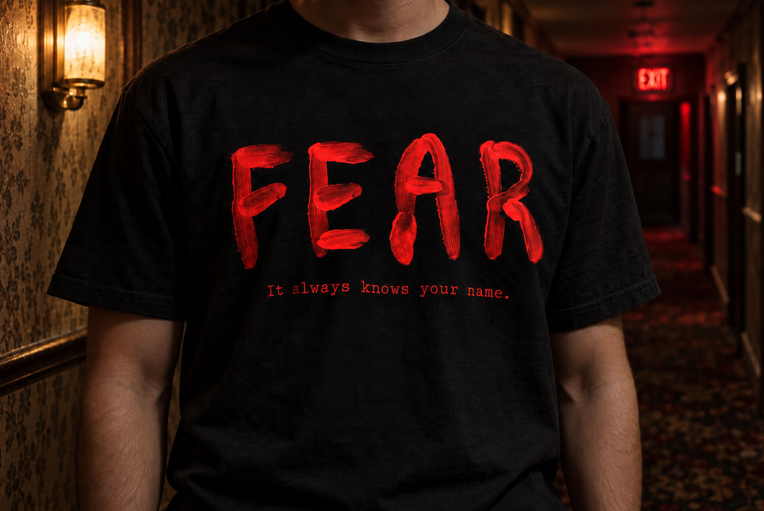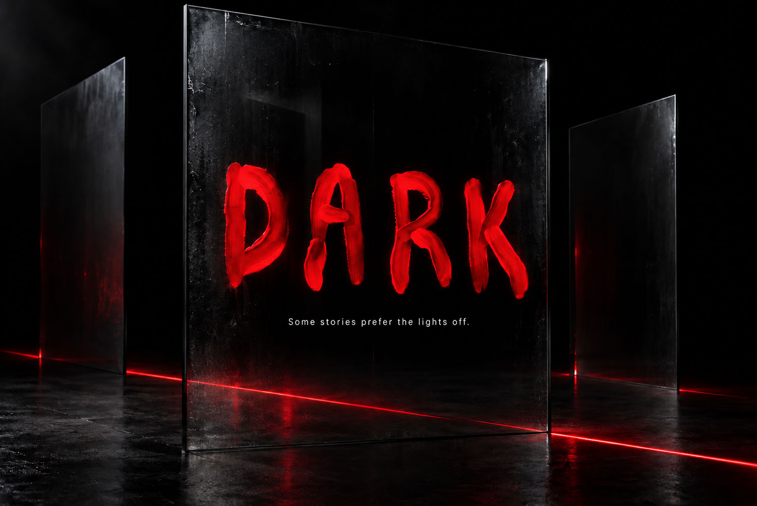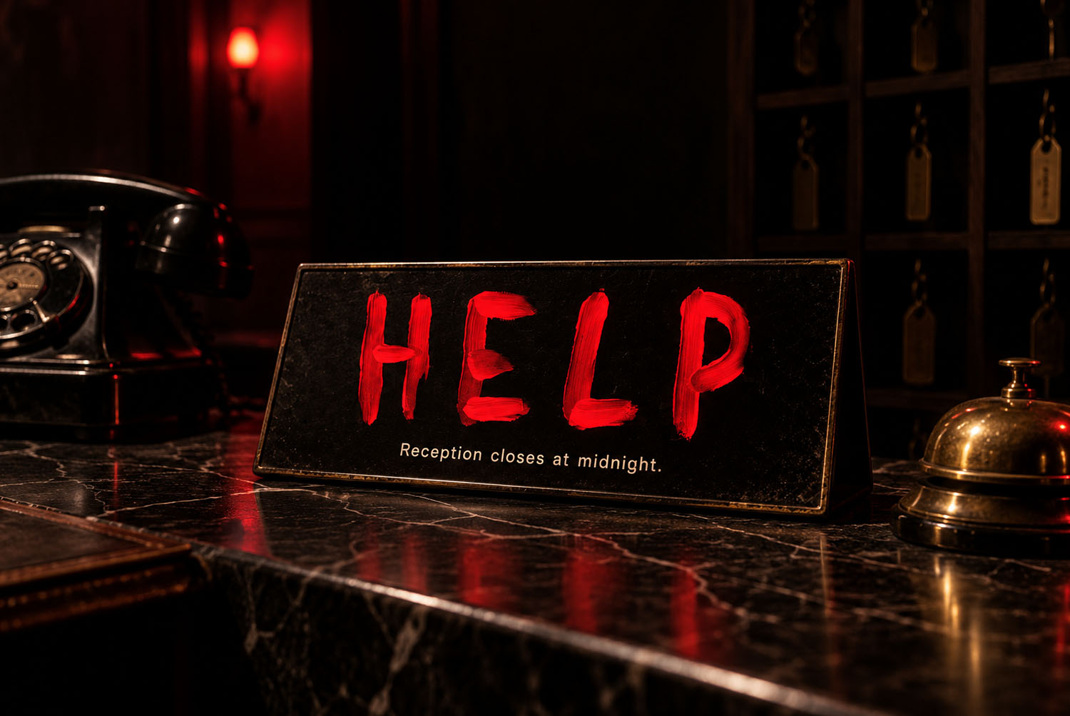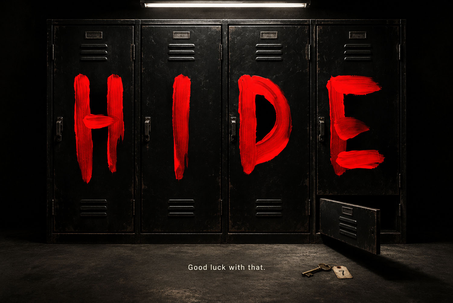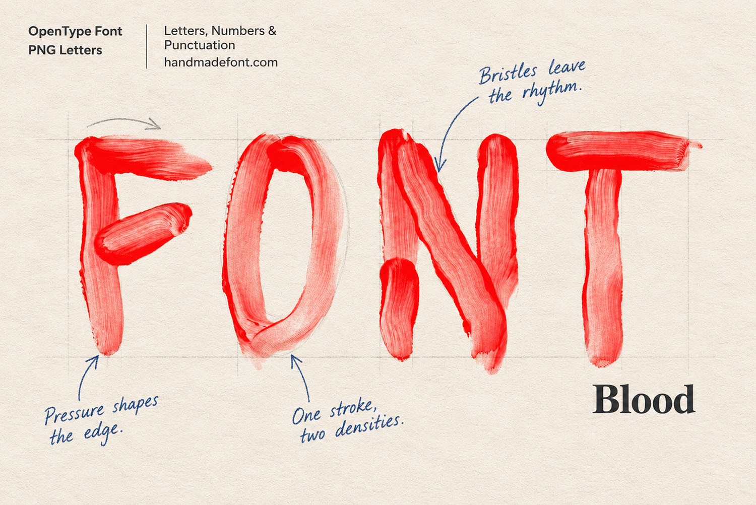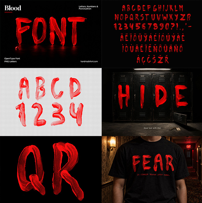
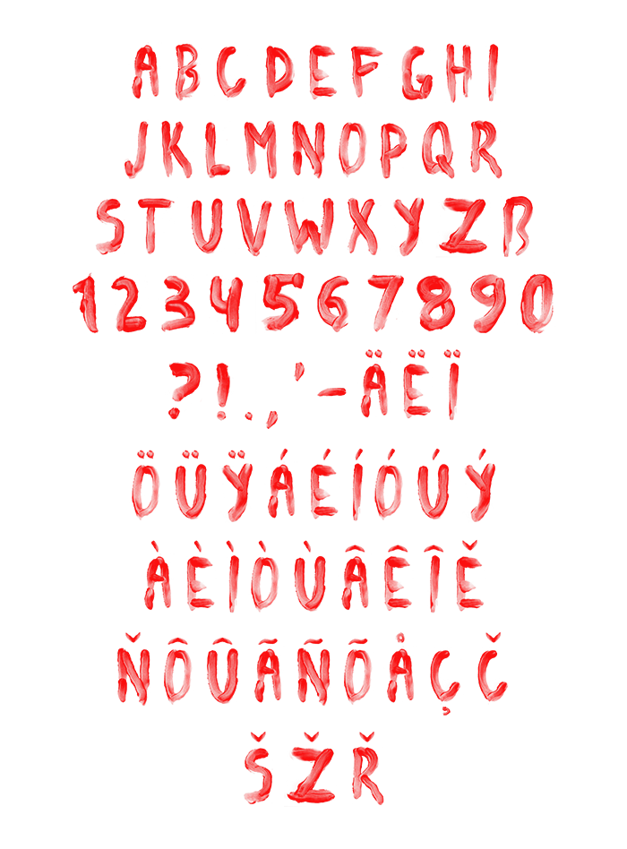
Blood Font is a bright scarlet alphabet painted with a real brush, one stroke per letter. The bristles leave visible tracks, the edges break into dry flecks, and the paint thins wherever the hand lifted. It reads as horror on a dark poster and as raw handmade lettering on white paper. Letters, numbers, punctuation and accents are all there.
Blood Font Is Paint, Not Splatter
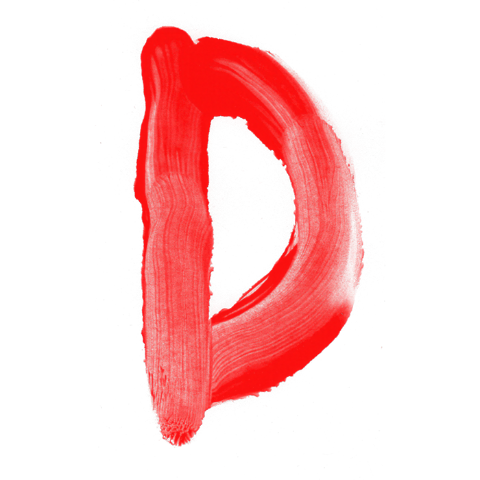
Nobody flicked a loaded brush at a wall here. Every letter in the Blood Font came off the brush in one pass. So the stroke starts thick, then thins out where the hand lifted. The red sits between scarlet and fresh tomato, bright rather than brown. Because the paint stays translucent at the edges, the paper shows through it. That keeps the alphabet closer to a warning note than a crime scene, which helps when clients get nervous.
Bristles Leave the Rhythm
Look closely at any upright, because the bristle tracks show up there as fine parallel lines. Pressure shapes the edge too, so one side of a curve goes solid. Meanwhile the other side breaks into dry flecks. Each glyph carries two densities at once, since the brush ran low halfway through. Numbers, punctuation and accented characters got the same treatment, naturally. Nobody smoothed anything afterwards, so the letters still look wet in places and scratchy elsewhere.