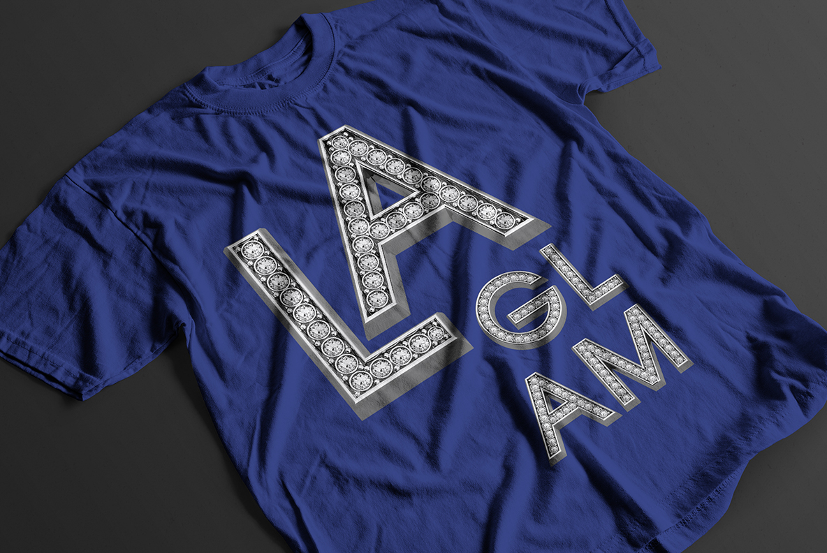
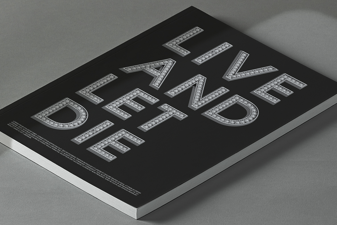
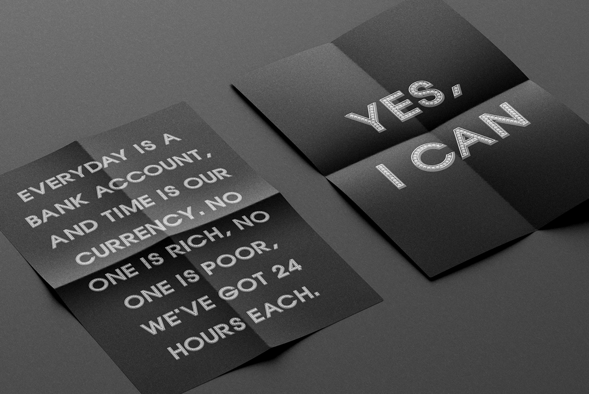
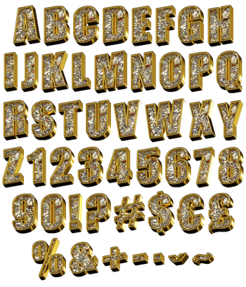
Blocky polished silver capitals with a channel down every stroke holding row after row of round white stones, each one in its own tiny setting. The Glam Font stays cold platinum rather than yellow gold, which keeps it modern instead of vintage. Figures, currency signs and punctuation are set exactly the same way.
Jewellery, Not Typography
In short, this alphabet behaves like a piece of jewellery. A polished silver body forms the shape, then a channel down the middle holds row after row of round white stones. Every stone sits in its own tiny setting, catching a separate point of light. The metal bevels sharply at the edges too, so the outline stays crisp. Because every stone catches light on its own, a word sparkles unevenly and looks real. Tiny prongs hold each one in place too, exactly as a jeweller would set them.
Silver Keeps It Cold
Colour choice does a lot here. Cold platinum silver keeps the whole thing modern, since yellow gold would push it towards vintage. Reflections run blue-grey across the flats, while the stones stay pure white. The letterform underneath is a blocky sans, so the jewellery never fights the reading. Besides, figures, currency signs and punctuation carry the same stones. In addition, the channel narrows on thinner strokes so the stones still fit.